HTML Workshop
Within this workshop I was asked to show my display of HTML coding knowledge by completing the following objectives.
"Challenge 1 - Create your first webpage. It should feature the following
- a title
- a heading using h1
- a sub heading using h2
- a list
- 3 images side by side
- a link to your favourite website
- an article which you have found on lipsum.com
Make sure the page uses correct markup for HTML 5.Once you have created the page visithttp://validator.w3.org and validate your page markupChallenge 2 - Adapt your first webpage.
- Change the colour of the title
- change the font family of the heading h1
- change the sub heading to h3
- make the list display horizontally with borders and spacing around each word
- Put 3 images side by side with a 5px black border around each
- a link to your favourite website which shows up as a different colour when you roll over it
- make the article more readable by using css styles to change colour, font, line spacing, letter-spacing, word-spacing"
Following the first challenge I began creating a title within the '<Head>' tag in a HTML document by creating a '<Title>' tag. This allows me to change the title of the webpage. Afterwards, I followed the next challenge steps and was able to create a functioning website with working links and images. By doing this experiment I was able to show my understanding into how HTML works and show developing skills for the future.

After finishing this tutorial I had checked to see if it had any errors by using NU HTML checker. I had done this to make sure that there would be no compatibility or visual errors.

At this point I began working on the alignment of the page and colouring of text in order to gain an understanding of CSS. By using CSS (Cascading Style Sheet) I was able to change the colour and the alignment of text used within the webpage to the centre of the page in order to suit my style of layout.

Tutorial Two - Cascading Style Sheet
In this tutorial I was given the task of creating a functional website with a header, two columns and a footer without any previous experience. I had used <divs> in order to create this look with the help from using CSS to format to page properly.

As mentioned above, using Divs to format my page out into separate pieces and had called them "Left column" and "Right column" to where I can change the style and format of them within CSS.

This image shows the CSS I had used for the website, shown in pink is element that I want to edit and within the brackets is code that affects the elements in certain ways, such as, "Display: Inline-block" affects the right column to make it fit on the same horizontal line.

To make sure that the website works properly I have put it through the Nu HMTL Checker to find any errors and have managed to fix any problems the have occurred.

Tutorial Three - HTML5 Learning New Elements
After creating the website in the previous tutorial, I then had to learn about the new elements that HTML5 have released. HTML5 has new elements, such as, <Header>, <Footer>, <Aside> and <Article>. This is meant to replace the traditional <Div> element for easier structure within a HTML file.

Below is the code that I attempted to use in order to understand the new elements. At firth I did not understand how to use it correctly so it had taken me a few more times, and looking at a few examples, before I could understand what HTML5 had to offer.

As you can see I still have a lot to learn from HTML5 as I have had some caution warnings appear.

Tutorial Four - Responsive Website
In this tutorial I started off with template to help me understand how responsive websites work, by using this template I was able to create my own website to my personal style and preference (along with the widget that came with the tutorial). This tutorial was meant to teach me about the use of media queries in order to make the website avaliable on different platforms.


Tutorial Five - Hamburger
I began learning about using Javascript within a website by looking at tutorials about the hamburger, which is a technique used by a lot of social media apps and websites, such as, facebook for example. By using Javascript I am able to create fluid animations and have the ability to change the view of the website through a script.

Here is the html code and basic view mode of the website I was working on for the hamburger tutorial. As you can see the options within the hamburger are shown within the visual side, as it will be invisible as soon as the page is launched.

This is how it would appear in the web browser to those who visit the site, the hamburger is fully clickable with slight animations to help along with it.


Interactive and Responsive Portfolio Project
Proposal
Project Introduction
Project Introduction
For this project I am given the task to create and develop a 'Responsive webpage'. For me to come to understand what and how a responsive webpage works I must first begin doing research into the subject and then take my knowledge to begin developing my own design.
Constraints of the project
During the course of the unit I will go through a series of problems that I will need to troubleshoot and research in order to get around my problems and create a successful page. These problems could consist of: Improper coding which could break the entire website, corruption or loss of data which will set me back to the start, and my knowledge, which can hold me back in my attempt to do something.
Context of the project
For me to understand how to progress through this unit I must first look at examples and a great example of it is 'Facebook', as they have changed their design throughout the years in order to suit the user and make their experience easier.
Initial Ideas for the project
I have been giving this project some thought, as I have to think heavily on how I need to structure it in order to get the message across about how I want to display my website. I need to take into consideration the resolution of different devices in order for my website to be really effective.
My initial ideas for my website is to create window type displays that would look quite clean. An example to this is something similar to 'www.facebook.com', which is a popular website today. To create something similar to this will help me with my own platform due to relation to the style, but this can also restrict me in terms of options as I will not be able to format it differently.
Deliverables
For me I would have to set targets in order to make sure that I complete the website on time and to the way I like it to be able to ensure it's successfulness. The main points to creating the website would be: research, rough draft, design, and finally creation of the website. I believe that creating the website will take up the most time so I would have to give a huge portion of my time to that part of development. Researching into how to create specific element within a webpage will come up as a major factor also due to my knowledge in website design not being the best.
Targets and Milestones
Week 1 - Tutorials, This consisted of learning new techniques that I have not used before in previous work, so it was something new to me.
Week 2 - Futher tutorials, This time I had spent my time learning about the use of a hamburger menu and embeding widgets into the page, but also making it responsive.
Week 3 - Research, I had spent the next two days working on research based around responsive websites, so I had to think about those that use it and already I had had websites like 'Facebook' and 'Twitter' pop into my mind as I knew they were responsive.
Week 4 - prototyping a potential website design on paper, This would allow me to imagine how it would look on screen and give others that view as well.
Week 5 - design, at this point I began working on researching HTML and CSS that I did not know in order to implement them into my own website.
Week 6-9 Further development of responsive website.
Week 10 - Finalization of website, On this week I had to make sure that the website was fully working with no faults or issues what so ever in order to present it on the following week.
Evaluation Methods
To be able to correctly evaluate the success of my website I must first test it on different devices and see if it works efficiently, only then will be the first step to knowing if my website was a success. This will allow me to meet certain critieria that is wanted, upon this I could look upon how to improve in the future. I must then allow for others to test my website and allow them to give their opinion in order for me to gain a understanding from another perspective, allowing for improvement in the future.
Research Stage
Before I can begin developing my own responsive website I must first show my understanding through several examples detailing how they work and how this makes them efficient.
A great example of a responsive and creative website is that of Facebook. Facebook itself has grown into a huge social media over the past ten years, which has grown it into a professional company that is built upon it's user-base to be socially active. Originally, the website had a very basic layout that only allowed you to do limited things, as the social media became more popular people began investing into it and it eventually grew into a fully fledged company with stock market shares, which was originally just one person with an idea. Facebook was so small that only a limited amount of colleges could have access to it, as time went on it became open for everyone to use and this allowed for the idea to grow.

This is what Facebook's homepage looks like today, as you can see there is a substantial difference to itself in 2004. This is because the company has thought about user interactivity and ways to improve the users experience, as that is the most important thing for a company to grow a positive reputation and popularity.

(http://cdn.ghacks.net/wp-content/uploads/2009/10/facebook_login.jpg , facebook log-in photo)\
Upon becoming bigger, they had to consider different ways to expand. They did this by creating their website for different platforms, like mobiles, in order to have compatibility for the mobile user base. As shown below Facebook have thought about how they need to customise their webpage in order to make it respond to the resolution that is set on the devices. This became such a popular design that other websites and mobile apps have considered to use it as a template, examples like; Snapchat, Instagram, twitter and tumblr.
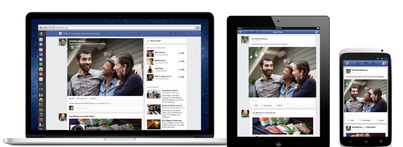
(http://cdn.macrumors.com/article-new/2013/03/devices-1.jpg , Facebook on different platforms)
Google is another company that has come a long way from it's roots as it started from a very basic search engine to a extremely profitable company that is invested in helping the average human into things they need; such as, world map, shopping, language translation and emails.

For Google to create a website to be effective they have created a internet browser that links users Google accounts to their webpage for preferred preferences, an example of this is where you view items on a store webpage and Google's system will remember that you may have an interest in that said item so it will advertise it in the future.
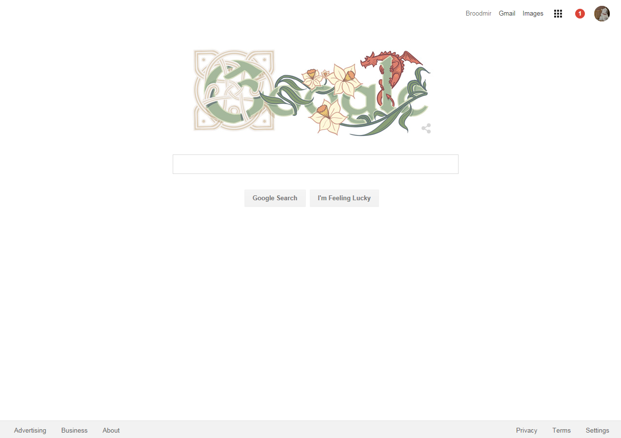

(Screenshots of Google.com)
Apart from this Google have also created an operating software for phones called "Android", which also connects to your Google account for the system to recognize your preferences and assist you in daily tasks. This has become very effective for the user to integrate their technology with their settings, but has also caused concern for privacy issues, as it collects information that has a potential for misuse. This is where discussion is needed in order to sort these types of problems out.

A very good example of a responsive website is a website titled 'What the heck is responsive website design?', which gives people an insight into how responsiveness works within a website. This website also gives several example websites that use responsive design in order to widen their audience potential, as desktop sized websites on phone are really hard to navigate with the user constantly shifting left and right to read, I have also known this from personal experience how frustrating this can be.

(http://johnpolacek.github.io/scrolldeck.js/decks/responsive/)
Jake brown's website shows an interesting amount of responsive interface along with stylised design along with it. This kind of design is what will inspire me when I make my own, as the layout shows to be very professional. I will begin to use inspect element in order to understand the process he went through to create this website, hopefully this will help me when I come to design my own website.

I resized the website and it appears to have some responsiveness to it, as it has changed form and layout. it also now has a hamburger instead of it's original navigational bar. By looking at this I gain a understanding into responsive websites and will deffinately influence me in my attempt in creating one.
 (http://www.jakebrown.co.uk/)
Jake brown's website shows an interesting amount of responsive interface along with stylised design along with it. This kind of design is what will inspire me when I make my own, as the layout shows to be very professional. I will begin to use inspect element in order to understand the process he went through to create this website, hopefully this will help me when I come to design my own website.

I resized the website and it appears to have some responsiveness to it, as it has changed form and layout. it also now has a hamburger instead of it's original navigational bar. By looking at this I gain a understanding into responsive websites and will deffinately influence me in my attempt in creating one.

Paper prototyping stage
I began making prototypes via thumbnails to be able to come up with a or various ideas that I could work on in order to have a final design capable of what I want to display. For this to be successful I need to take into account several factors, such as; appeal, style, layout, and the effect the website gives off to the viewer. This is majorly important, because I want to be able to advertise my skills in order to further myself within the games design world.
For template one I had decided to go for a compact view in order to give off a professional, clean, and square look towards my website. The website would display a JavaScript animated slideshow showing the best of my work, then have recent work shown below. I believe this to work especially well for a blog type website, as I could easily display things in a square manor.
In template two I wanted to create a tablet friendly website that had it's navigation bar and new on the sides that where able to be pulled out. I believe that this design was quite creative and has not been done much at all in the past so it would be quite original. There are several problems to this design though, as it would not work efficiently at all on mobile phones or computer screens that are not landscape 16:9, 16:10 scale.
On template three I put together the same navigation from template one and added a YouTube video that could show reel the best of my work, below I could show recent work alongside images that switch sides with each new topic in order for the website to get a different feeling than regular blog websites. I believe this design could work very well both visually and responsively, because it is a neat design with resizable parts. The only downside towards this is that it would use the YouTube plug-in in order to show the main display, if the user has a system that doesn't support this plug-in then the website will display as a blank page. For the other designs, I used similar elements and put them together in order to create some potential ideas that could help me prior to the design stage.
The rest of the designs had input similar to the original three, but with slight changes to positioning and style.

I have created a full page paper template to show what I would like my website to look like, the sections within this image are elements that I want to take into consideration. For my webpage I would like it to display my current work via a slideshow at the top of the page in order to interest the viewer into looking into my website.
Below I would have two sections that different in terms of content as one will have archived work that I have recently made along with a professional analysis of how that project went. On the right side I would like to put a live feed of any social media that I may use in order to keep the website fresh and updated for those who read it. After showing at least the past 5 archived news reports I would have the footer appear at the bottom along with links towards contacting me, following me on Facebook and any other social media that people may use.

Design Stage
I began with creating the basics towards my website by creating a HTML and CSS file and placing them side by side within the Brackets application. I created a basic format using headers, divs, and nav elements to separate my page apart.

In this photo I began inserting HTML links within the nav bar so that the user can click on them, which would take them to another website. In order for me to design the look of the website I needed to create a CSS file (Cascading Style Sheet). This file allows me to edit the look of certain items based within a HTML file, as you can see on the right side, that I made the header black by calling for the Header through it's class also known as ".Header". This works because I had specifically named the Header as a class within the HTML file so it is as if both files we're talking to each other on how to look.


This is what the end result for the navigation bar looks like in it's basic form due to the coding I had put in place in the CSS file.

At this point I started again, as I had ruined the format of both the HTML and CSS files, as they contained information regarding a JavaScript file that I was no longer using and it had become increasingly difficult for me to understand what went where. I started off by creating the hamburger menu as that was the most important thing for me currently. Using media queries I am able to change the layout of the website depending on its screen size, so as you can see from the images below that the navigation bar adjusts itself for the user in mind. Within the first image you see that there is no text and there is a button in the corner that allows for a hamburger menu to pop up. Within the second image is what the website would look like if the user was viewing the website via a desktop computer.


Comparison photo between the two views, you can see that one is more updated that the other, as I had made a mistake to not refresh the page.

After having the hamburger navigation menu working I began to work on the content that would display on the website. I started off with a widget that was given to my by twitter as a way to keep viewers updated on social media from me. To make sure text worked within the box I plan to use to showcase work I had pressed random buttons in order the fill the box.

After everything was in place I began working on displaying content within the article part of the page. I have done this in order for me to understand how the website reacts when there's more than just two lines of text within it. As you can see the Twitter feed on the right side has been pushed down indicating that there is some clipping on the two divs. To further understand that this really has happened I put a border on everthing in order to see if the clipping is occurring.

I then fixed it by making both of them 'Display: Inline block;" in order to shape the divs depending on the contents within it. For it to constantly work at that size I need to change the width of both sides in order for them to always match and not collide into each other.

I removed the borders again to make sure it works effectively and has appeared to have done so. I then began working on the text for the article.

I then began testing it's responsiveness when I change the width it has appeared to have changed to the way I wanted.

After finishing the structure for the article section I began creating more article that people will be able to view.

Testing on devices
I found out that you can test websites using Google Chrome's inspect element, which has an option to simulate websites on virtual phones and devices. Here I test to see how my website works on those devices, both vertical and horizontal. Here I use an 'apple iPad' and then other devices.


Developing other webpages
After creating the index page I began working on a second page that would display work that I deemed to be the most successful over the course of my time within the college. I am unsure to whether I will change the look to this page as I feel that it works, but also has some drawbacks at the same time. I feel that I will need to create some potential prototypes on paper.

I had some advice to liven up the page with a background change or possible colour change or a background so I began working on a test image within the footer.

I wanted the image to be really faint in order to give it a complex look rather than a plain blue background.

I begin to have doubts about using it as a transparent background after viewing it in this form, as it overlays images and text. I had envision it to be in the background,but for some reason just did not appear.

At this point I heavily decided the removal of the background as it overlay other images, which could give off the wrong impression because of this overlay.

I finally finished the footer for the website that will appear on all pages(The about text has more to it than this image). I have included links towards all social media and related media that is connected to me in order for the viewer to further look at things I do and potential have the effect to impress them.

To be able to see if my webpage successfully worked on a smart phone, I had used my own HTC One M8 as an example. it has shown to be responsive towards the width of my phone, showing the twitter widget fall down below when there isn't enough space on the screen.
No comments:
Post a Comment