 |
(http://41.media.tumblr.com/2083219a97
da0e3063aa08f594e17780/tumblr_mv6cao8nTx1 r84jico1_1280.jpg) |
concept art has many purposes, including helping others understand art style or perhaps to allow for someone to understand a visual idea that the artist had in mind into physical form.
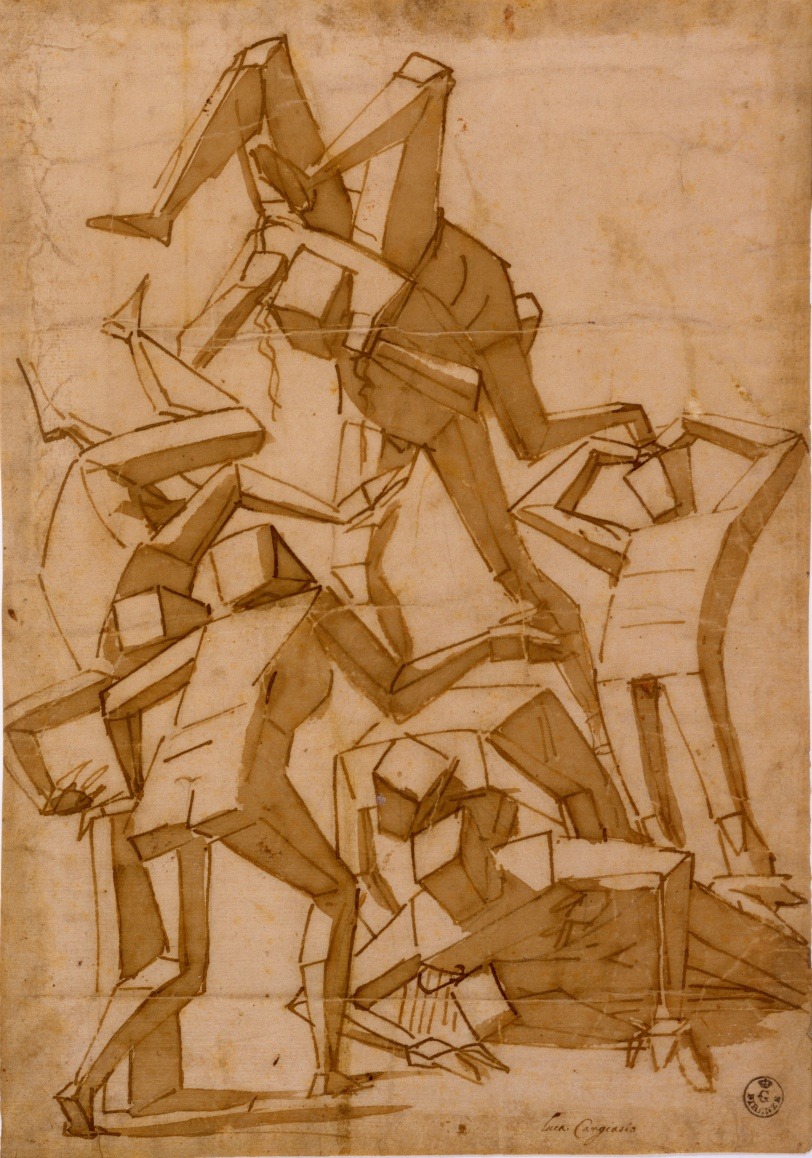
The concept art on the left side was an art piece created by Luca Cambiaso, in order to study the human figure. This was created in the 1560's and has some sense of cubism towards it. Luca Cambiaso's work seem to be based around human form and his simplicity allows for others to learn from his work and portray it in their own work. In today's times a lot of artists learn from this technique, as it is a very important and useful step in the art world in order to draw people.
 |
| (http://upload.wikimedia.org/wikipedia/commons/9/9e/Peter_Paul_Rubens _110.jpg) |
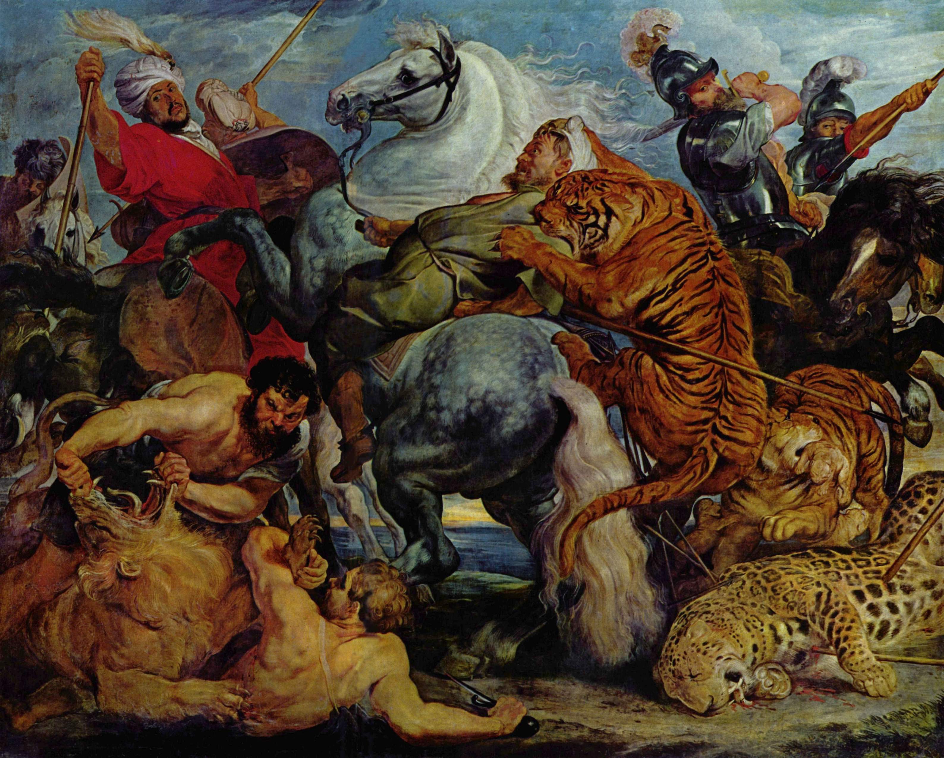
This piece was created by Peter Paul Rubens and was called 'The Tiger Hunt', which was created in 1617. Most of Rubens work depicts religious or mythological with partial nudity appearing sometimes in his work. Peter's work help many understand the concept on how to draw human figure.
His surreal paintings are quite inspiring to me, as for a someone in the 1610's to come up with work like this is astonishing. Of course some of them where based upon stories, but to visualise it for himself and create it in display is something magnificent.
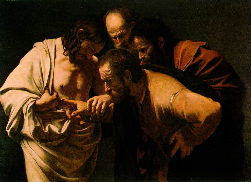
This art piece of Jesus was created by Caravaggio in 1601-2. Caravaggio was a extremely famous artist in the 1590's. Caravaggios art was so popular, that he was known as "The most famous painter of Rome". His artwork usually features realistic human figures as seen on the right, but he also painted surrealistic as well.
Caravaggio's realistic lighting and preportion has inspired people throughout time. His artwork allows us to understand the human form and how to properly convey it.
 |
| http://www.ibiblio.org/wm/paint/auth/caravaggio/st-thomas.jpg |
This art piece of Jesus was created by Caravaggio in 1601-2. Caravaggio was a extremely famous artist in the 1590's. Caravaggios art was so popular, that he was known as "The most famous painter of Rome". His artwork usually features realistic human figures as seen on the right, but he also painted surrealistic as well.
Caravaggio's realistic lighting and preportion has inspired people throughout time. His artwork allows us to understand the human form and how to properly convey it.
Personal favourite Artists
 |
| DimaiMikaz: http://damaimikaz.deviantart.com/ |
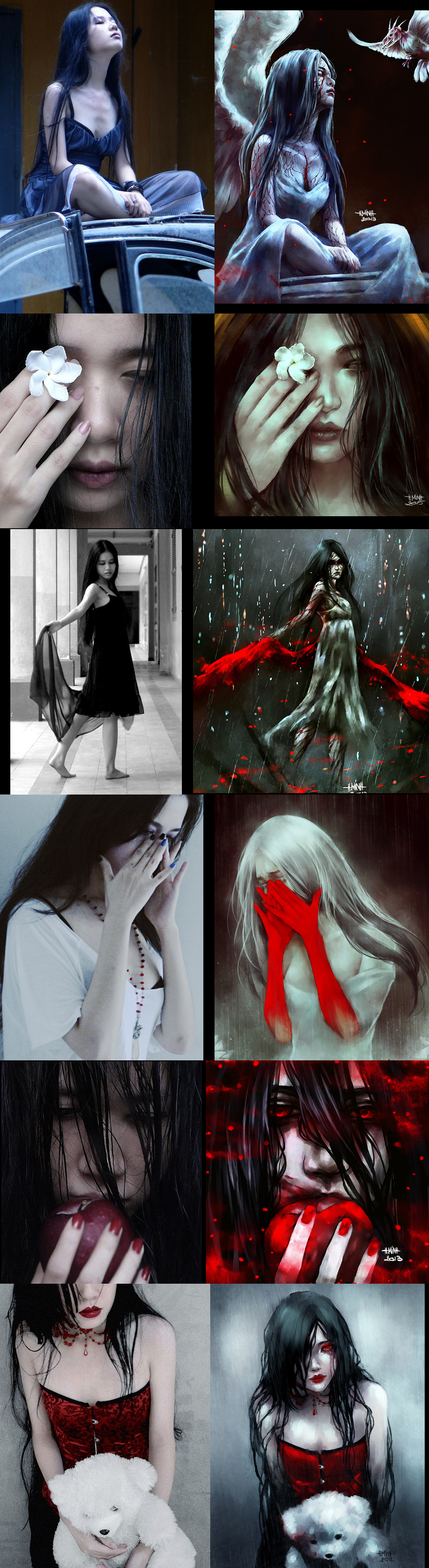
DimaiMikaz is a artist on Deviant art, who has 50,000 followers and is a hobbyist drawer, but her artwork has come up to a professional standard and ever since I joined 'Deviant Art' the artwork is something that currently inspires me in my own artwork. Every day I practice my art style to bring it up to a standard that is close to hers. He art pieces are generally concept art and final pieces. She appears to draw mostly surrealistic art and draws artwork related to her novel created in 2006.
http://damaimikaz.deviantart.com/journal/F-A-Q-378858817
According to this page she is self taught by learning from the internet about how to draw effectively. With long enough practice and lessons, I should be able to achieve this art style one day. Her art features mostly humans, which means she would of had to learn about proportion among other things.
 |
| http://31.media.tumblr.com/tumblr_mai6txvrn41qzlpr4o1_1280.jpg |
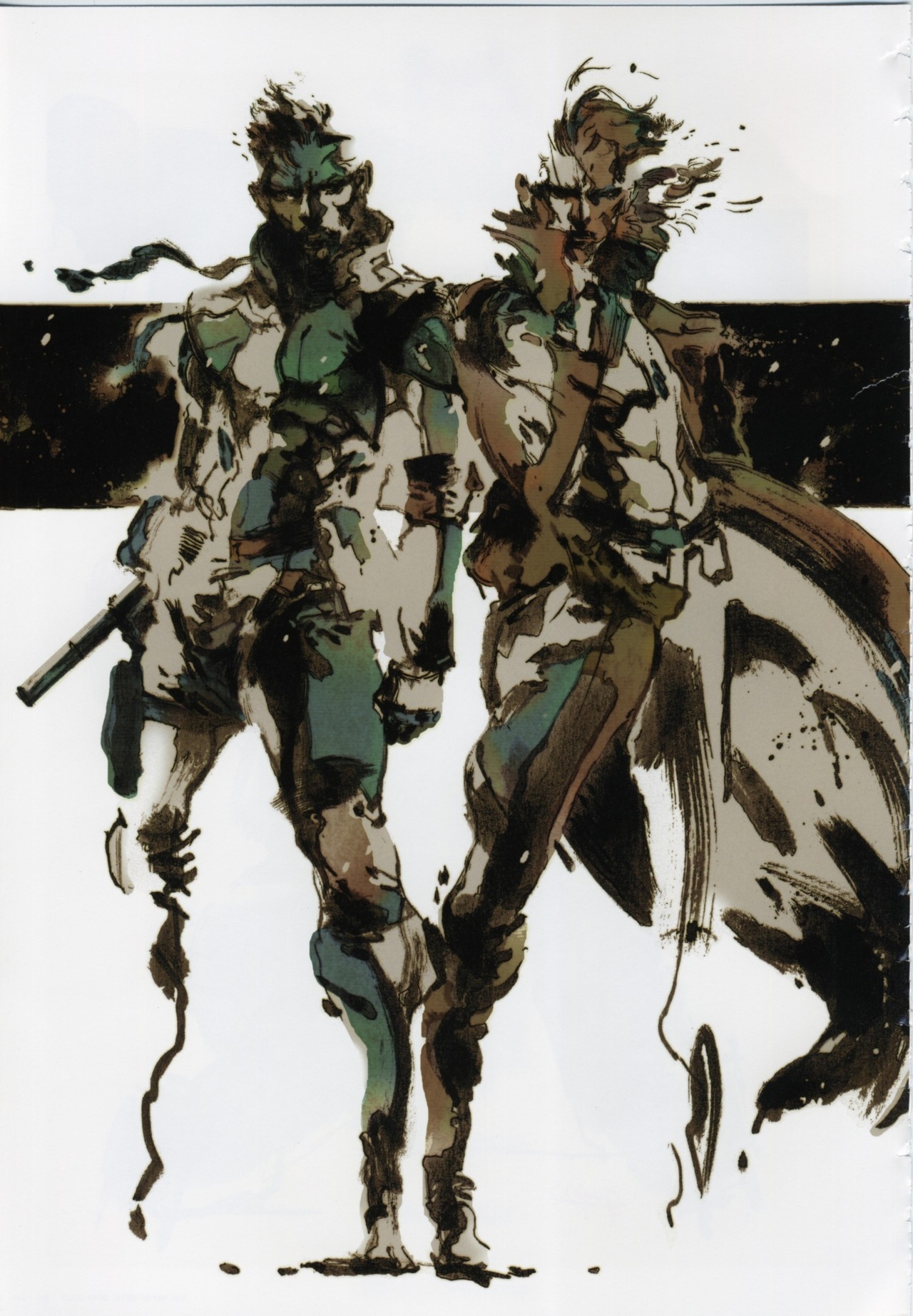
His artwork and Hideo Kojima's game has inspired me to become a games designer in the near future. It is what drives me as an artist today. His art style features felt tip pens and shades of colour to display characters. He also uses Adobe Photoshop for production of the characters.
 |
| http://nanfe.deviantart.com/ |
By looking at past examples and references of herself she is able to see human proportion and create realistic human figures.
 |
| http://cache.gawkerassets.com/assets/images/9/2011/10/hzfkl9vg.jpg |
This is concept art from a game called 'Dark Souls', created by 'From Software'. I like this piece of work especially because of the amount of detail put into the rough sketches show the lighting on the armour.
Makoto Satoh was the lead graphical designer on concept art based around the game.(http://www.mobygames.com/
developer/sheet/view/
developerId,207200/). Not much information can be found on the internet about Makoto Satoh so I could not find out about his artistic history or what had inspired him in the past.
Architecture
After researching several artists in the past and several of our generation, I began drawing things from the real world.


For this assignment I had to learn how to create realistic human figures using a series of circles and lines to create a wire frame. Below is a sculpture, which was on display in the classroom for me to use as reference for the human head. much like the work of Luca Cambiaso I had to understand the wire frame in order to create recognisable figures.


After creating Zeus in 3 dimensions I was inspired to create my own art using charcoal, which at the time, the ideas just came to mind. My idea on the right was inspired by a storyline within a game called 'Warhammer 40,000'.


concept art development
References used:
http://flawedart.net/courses/articles/Gibson_Burning_Chrome.pdf
http://youtu.be/IYMosNGR6Mg?t=6h14m56s
I began my concept art project by writing down important information about each character, places that they go to and objects that are in the story. For my concept art project I had chosen to do Burning chrome, a story set in the future in a cyberpunk world. The stories location and feel is very similar to that of 'Blade Runner'.


This is my second character that I had designed. Her name is Rikki and she is an important part of the Burning Chrome storyline, as most key aspect are based around her and what she does.


I then moved onto object design, on which I had to create a Russian chip that was supposedly capable of hacking into any computer anywhere, but that was only the story. This chip did not have any discription to what it looked like so I came up with different ideas to how it could've looked.


For my next design I have chosen to create the character Bobby Quin. In the story for Burning Chrome, it is said that Quin wears sun glasses, but I wanted to go for a more futuristic look, so I replaced it with a visor. He is also mentioned as a cowboy with a stubborn personality, so I had wanted to give him a brown trench coat, much like the main character of 'Blade Runner'.

 After creating a location for chrome, I quickly began working on chrome herself. She wears a leather jacket with jeans that is held up by a multi coloured belt.

For my second location, I had chosen to do the inside of 'The gentleman's Loser'. I wanted it too look like a dim dining hall with a bar on the side, which is used frequently by both Quin and Jack.

Final Piece
I had started off with the original file I had start off with to create the setting scene.

I then traced over it on a new layer.

I began adding colour to the background.

I then started creating the character Rikki.

I then wanted to finish the background colours and I had decided to move Rikki up further in order for me to fit an extra character onto the seat.
 I then started creating Automatic Jack leaning against the bar pondering and the chip.
 I create a base for Quin.
 I then added colour to Quin and put a gradient overlay on top of the final piece.

Here is the final design in png format.

Here is a video overview of the steps I took in order to create the final piece.

References used:
http://flawedart.net/courses/articles/Gibson_Burning_Chrome.pdf
http://youtu.be/IYMosNGR6Mg?t=6h14m56s
I began my concept art project by writing down important information about each character, places that they go to and objects that are in the story. For my concept art project I had chosen to do Burning chrome, a story set in the future in a cyberpunk world. The stories location and feel is very similar to that of 'Blade Runner'.
I had created some mood boards from my previous unit, unit 1 Visual Recording, which featured the same cyberpunk genre and feel to this story, which can be seen below.


I then created another one, which I created specifically for this assignment. In this moodboard I put images of things that currently inspired me in the artwork. I had a heavily influence from the music I listened to, Celldweller's story telling within music had brought many ideas to my mind for possible artworks. Along side blade runner, which is said to be one of the best and most influential cyberpunk films ever made.

I had started off with the location set in the story called 'The gentleman loser'. I had thought it should look quite small and be set in a urban location to really set the scene. I had begun by drawing it in a traditional style and then bringing it through Photoshop, tracing over it and then giving it colour. I really wanted to give it a dark dingy feel to it, to look as if the streets were abandoned or less maintained in order to maintain the cyberpunk feel.

I then went on to create some characters. This character is 'Automatic' Jack, a strong tough tall man who has a mean look to him, but once you get to know him, he is not all that bad.

This is my second character that I had designed. Her name is Rikki and she is an important part of the Burning Chrome storyline, as most key aspect are based around her and what she does.
I then moved onto object design, on which I had to create a Russian chip that was supposedly capable of hacking into any computer anywhere, but that was only the story. This chip did not have any discription to what it looked like so I came up with different ideas to how it could've looked.

For my next design I have chosen to create the character Bobby Quin. In the story for Burning Chrome, it is said that Quin wears sun glasses, but I wanted to go for a more futuristic look, so I replaced it with a visor. He is also mentioned as a cowboy with a stubborn personality, so I had wanted to give him a brown trench coat, much like the main character of 'Blade Runner'.

I then began working on the villain of the story. I began thinking what 'Chrome's Halls' would look like, and I had the idea of a digital world in where chrome can relax and change form depending on how she wanted it.


For my second location, I had chosen to do the inside of 'The gentleman's Loser'. I wanted it too look like a dim dining hall with a bar on the side, which is used frequently by both Quin and Jack.

Final Piece
I had started off with the original file I had start off with to create the setting scene.

I then traced over it on a new layer.

I began adding colour to the background.

I then started creating the character Rikki.

I then wanted to finish the background colours and I had decided to move Rikki up further in order for me to fit an extra character onto the seat.


Here is the final design in png format.

Here is a video overview of the steps I took in order to create the final piece.
I then created a title for my portfolio for the Burning Chrome concept art. I really like the typeface I had created for this title as I feel it gives off a futuristic feel towards it.
