Creating a face with food (overlaying layers)
In this lesson I had to learn about 'layers' and how they work together to create an image in Photoshop. I was given stock images of several types of food and was told to create a face. This was quite simple, as I have used Photoshop quite a lot before this tutorial, so I had the experience to make this.

As seen below is the final design. I had used a 'layer mask' on the brocoli, by selecting the layer then going to Layer > Layer mask > Reveal all. This allowed me to begin editing the original image without losing its original form and would allow me to return to it if I made any mistakes. I had used a small brush with a "25% fill" This would allow me to blend two layers together,

For my next tutorial I had to do something similar to the first tutorial, but this time I had to use tools like 'Magic Wand' to cut out different parts and place them on a template in the middle of the image.


Creating a major disaster
In this tutorial I had to create a believable disaster. First, I had to find a image of a location that would set the disaster and then I looked for angels, as I wanted people to believe that angels were appearing. Using blurring tools I had attempted to create a believable image as if the angel was causing immense light, but I had not liked how this one came out so I created a second image.


For my second idea I wanted to create an image in a major city with the disaster being a meteor coming down from the sky. I like this one more than my first design, as I had used overlaying colours on the meteor to make it look as if it was pulsing light.


Using layer masks to create a believable image
In this lesson I had been taught how to use layer masks along side changing how much flow the brush I was using each time I was draw across the bug. I had also put a light drop shadow on the plate to make it look more realistic. I put a ripple in the drink to give the illusion that something is moving in the water, which is the bug.


Using these ripple effects and layer masks I had to create something similar to the original tutorial, but from my own ideas. I had chosen to create a shark in a fish tank.


Fixing an image of poor quality
In this tutorial I had to learn how to fix images that had been taken with poor quality. Below is the original image.

To fix the image I had to use a tool called 'Levels'. Levels allow me to change the colouring within the image. I get to choose whether I want to change all the colours at once or do each individual colour. In this image I had started with red, green then blue.


After I believed that I had gotten it to the correct colours I had put up the saturation of the image to make it more colourful and more enjoyful to look at.


Creating surrealist art
For this tutorial I had to create surrealist art. To do this I had chosen to use the portrait of 'Hideo Kojima'. Using The lasso tool allowed me to create duplicates of selected areas that I had chosen onto new layers. I wanted to focus on the eyes and the mouth in this image to make it look as if Hideo Kojima was an all seeing god type structure.


Creating polar co-ordinated images from panorama
In this tutorial I had to create a planet out of a panorama. To do to, first, I need to create an offset in the image so that it would overlay itself. This would allow for the end result to come out like a planet.


I had tried to create the planet before, but it came out inverted so for it to come out like a planet, I needed to flip the image upside down.

For the final step, I used Polar co-ordination to make the image focus into a ball like shape.


Using overlays to create a hoax image
For this tutorial I was provided stock images that I could use for a hoax image.

I had started off by selecting the are of the road that I wanted in the image and then used Select > Modify > Feather to allow the two images to blend into each other.


Afterwards I used the marquee tool to select the moon image and used the same feather tool with a lower selection radius so it would blend into the image less.


For my final image I was impressed that I was able to pull this off to this quality. It makes for a great poster.

Digital Collage - Creating a monster
For our collage task I had to colour the image below to my liking. This would allow me to use it in my final collage.


I used several different techniques to create this monster, mostly being gradients to give off different effects.

Using a series of blending effects and textures I was able to create this background for the monster that I had created previously.
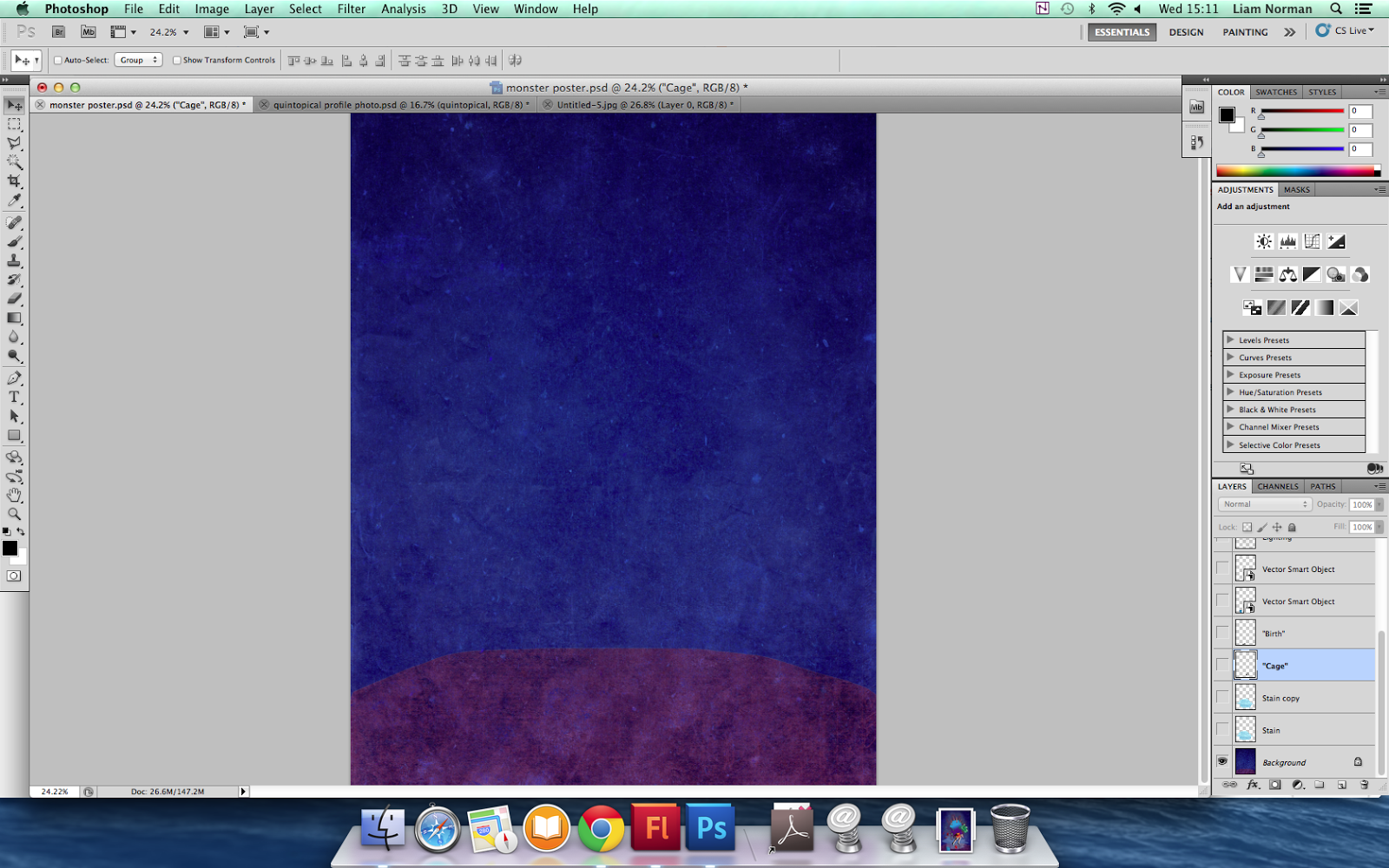
I had pasted in my creature that I had created. I had also given it legs and a finger to make it look like it it could walk.

I had duplicated the legs and put on a overlay on them to make them darker.

I had then put down a paint splat behind the creature at a low opacity and also put in some back light.


I then added the two letters "B" and "C" to my image. I then used hand drawn writing that I had scanned in to add to the "B" and "C".


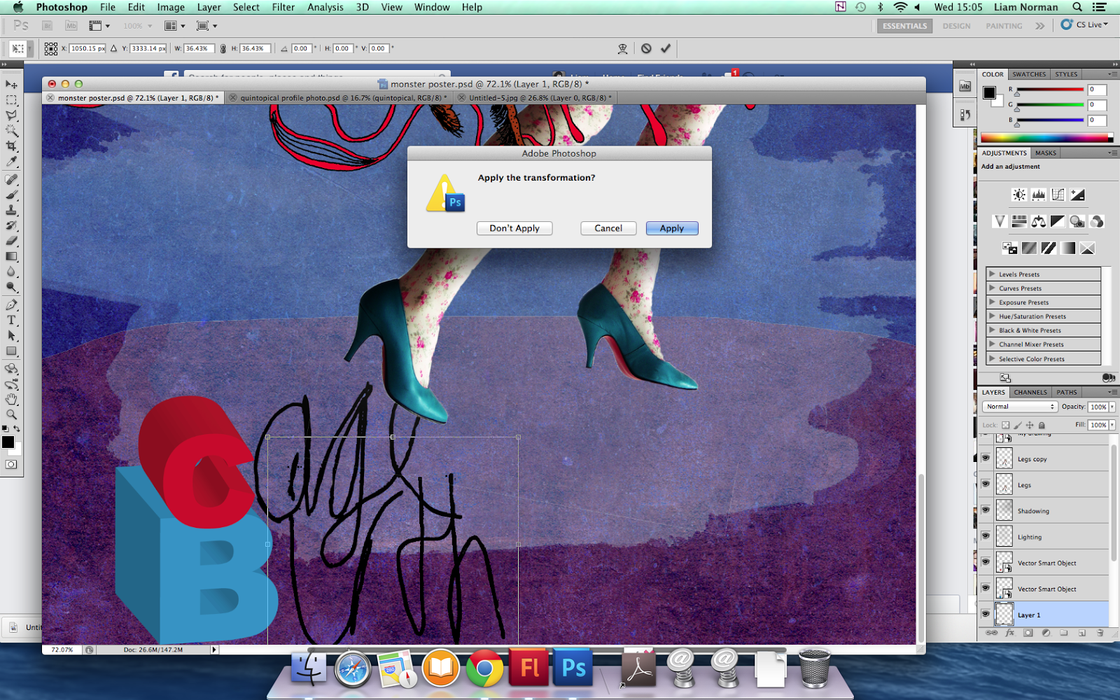
This is my final design. I am very pleased with how it came out, without all the techniques that I had used, it would not have been possible.

Creating my own digital collage
For my own digital collage I needed to find a stencil image of a character that I could use for the collage. When I found this samurai I found it's stencil outline to be quite thin so I had expanded it slightly.


I then began adding colour to the Samurai stencil.

Then I started puting overlaying textures to some parts of the armour.

Lastly, I added a drop shadow.

I then added a background to the piece.


Editing typography.
For this tutorial I had to learn how to create typography that was edited with textures. First, I created a background using a gradient overlay that mixes red and white to create white space in the middle of the design.


I then used a brush with the colour white and low opacity to make the middle even more white to attract the eye to it.

I then added a scratched metal texture using a overlay mode to blend it into the colours.

To create the skin writing I first needed to write it using the text tool and then overlay a skin texture on top of it and cut it out using the text as a base for where to cut out. I also burned the edges using the 'Burn' tool and lightened the inside using the 'Dodge' tool.

Afterwards, I cut the 'I' and moved it up slightly to allow me to put meat behind it to make it look like as if it were cut open.


Creating a art piece based around typography.
I was given the task to create my own art piece just like the 'Skin' one I did previously. For me to do this I must first look at pre existing typography designs to get a feel for what I should design mine like. Looking at these I can see that the creators had tried to base their designs around the colour and style of what there word is. For 'Glass' The text is sharp and translucent, matching that of glass itself.

I began creating mine in the same style of the skin one I had done earlier by using a gradient overlay.

I then added a texture of circuits, as it reminds me of the word I had chosen, 'Cyberpunk'.

I had then found a type face suitable on 'Da-font' that would match that of my word.

Doing the same thing I had done with the 'skin' design, I had selected the text font, inversed it and then put a texture on top of it to create a design inside the word.


I then added a white backdrop to focus your attention to the middle of the image.

I then started working on a design that would match the word. I had split up the word and begun creating circuits that attached the two words together.


I then looked at different background texture design that may work with the word, but I had felt that it did not. so I had used this background into a blend with the original to make it look as if it was all scratchy.


Collage test
After all the tutorials I had learned and have created, it was up to me to see if I could put those skills to the test and recreate a pre existing collage. I had found it quite difficult, as I was being timed on this particular task, so I didn't have much time to practice and test.
Mine:

Original:

Bristol based collage
After finishing the collage test, it was time for me to move onto a collage that was made from things that I took pictures of, or scanned in.
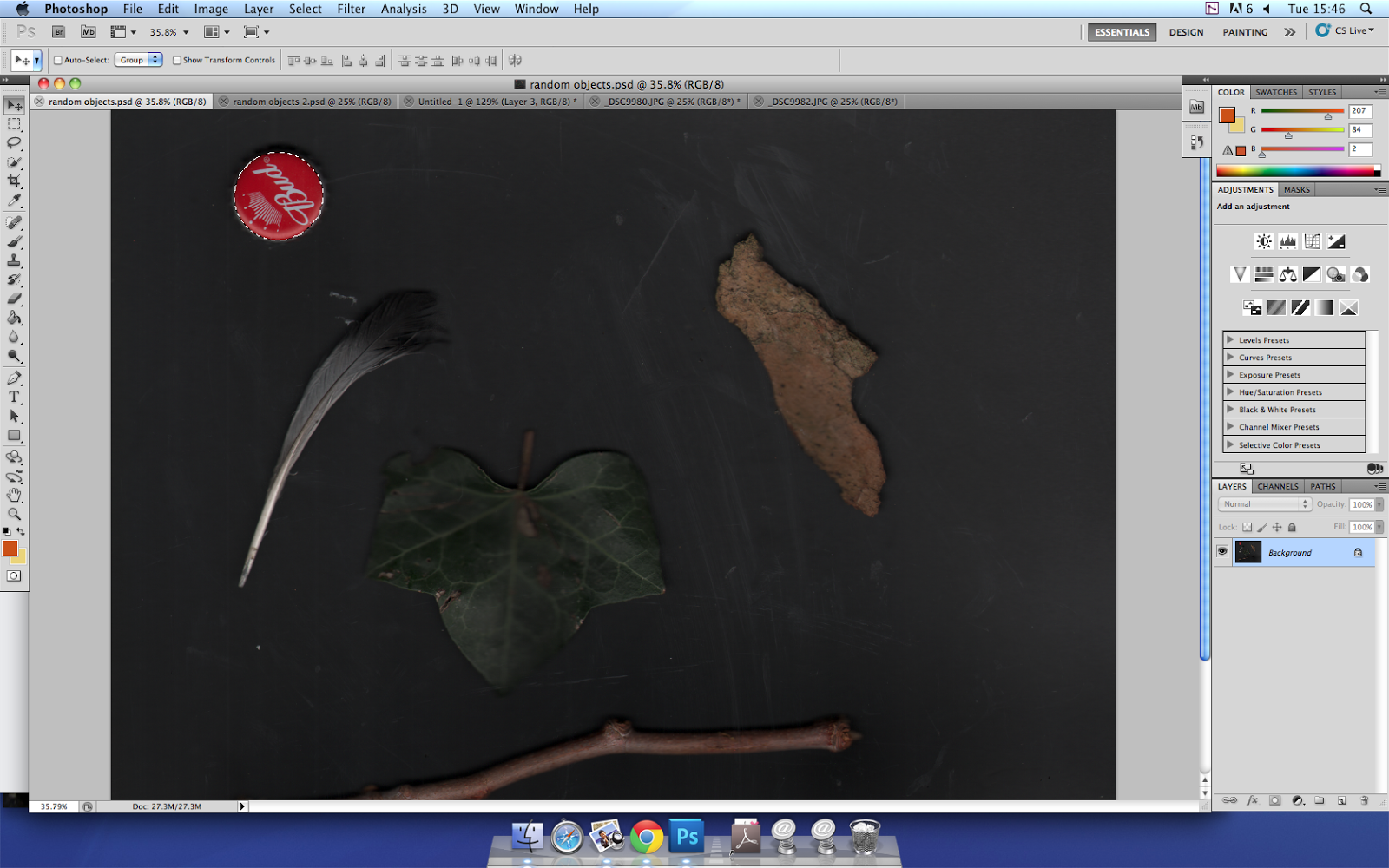
I had begun this by using the leaf for an overlay on the main piece.


Using 'Overlay' blend type I was able to create this effect in the image.
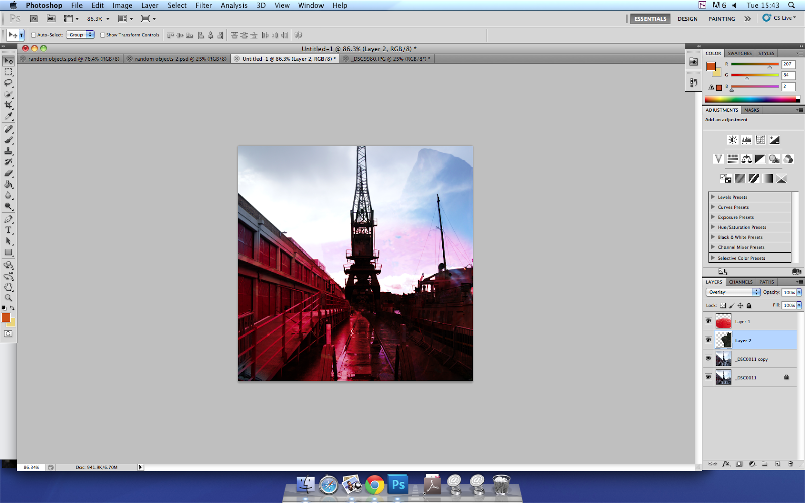
I had done the same for this grafiti I had found. I started by selecting the white grafiti and pulling it into the main image.


I then used the bottle cap from the previous image to overlay it onto the track lines.


Deer collage.
Following this tutorial: http://psd.fanextra.com/tutorials/photo-effects/create-a-nature-inspired-digital-illustration-in-photoshop/
I was able to create this deer collage, but I did not want to follow the original image as I felt that I would not learn as much from just using the tutorial, so I had created my own version.

Homework collages
Following this tutorial: http://tutorialfreakz.com/collage-of-polaroids/
I was able to create the following image.
In this polaroid tutorial I followed the tutorial on how to create the effect.

Firstly, I had created a black square for the area that I wanted to use within the polaroid area, then I duplicated the photograph and turned it into a clipping mask to create the image below. I then added a white outline and grouped the layers.

To create more polaroid I just had to duplicate the groups and move the black square that I had used for a clipping mask.


I had also added a drop shadow to the polaroid to give the feel of overlapping.

For this tutorial: http://psd.fanextra.com/tutorials/photo-effects/create-a-striking-collage-fusing-ancient-and-modern/
I was able to create the following image.
I had felt like the polaroid collage was too easy of a collage to do over the spring holiday and so I created another collage from a different tutorial. Following the tutorial I had used a layer mask on the mountain image to get rid of the sky and applied a paper texture behind it.


In illustrator I created this design, as following the tutorial and had applied it to the background on a low opacity to give it a surreal effect.

I decided for my bust/statue that I wanted to use Leonidas, as I enjoyed the 300 film a great deal. I placed it into the right place as the tutorial had suggested.

I then began applying adjustments to the bust to give it a old feel to it.

In this image I had duplicated small sections of the paper texture and liquefied them to change their shape.

I began create shapes to spice up the image. The red reminds me of the colours used by the film 300.


I added a quote from the film to remind people of it and also help remind people who the statue is of.


Photoshop collage tutorial
In college I had to follow a tutorial that was created by my tutor to monitor my progress. This is my version, based on the original, but with slight changes. I like this piece as it show a large display of surrealism within itself, which asks the viewer, what is going on?

Top 5 favourite collages

http://www.pageresource.com/wallpapers/wallpaper/collage-vintage_417616.jpg
I like this collage because of the amount of overlaying the person has put into this, also that the person has not overdid it with the colours that he has used. A lot of the objects used within the piece blend quite well into each other. However there is not particular relation between the object so I am left to question what the collage is of. My eyes when looking at this are first drawn to the key as it is the darkest object within the lightest area on the image.
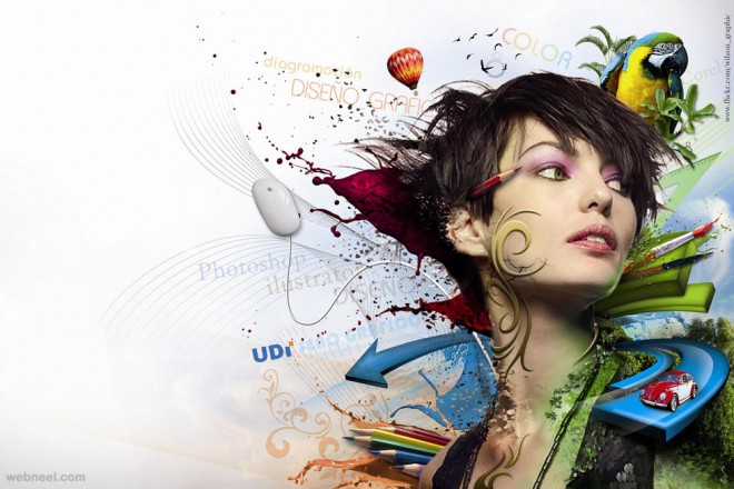
http://webneel.com/daily/sites/default/files/images/daily/10-2013/12-photoshop-collage-effect.preview.jpg
I like this collage especially because of the idea behind it, to overlay things ontop of a person can display their ideals, what they have done, what makes them them. The car in the bottom right corner is using a layer mask to blend itself into the person. The pencil is blended into the hair and uses a drop shadow. I like the overall look the person has put into this.
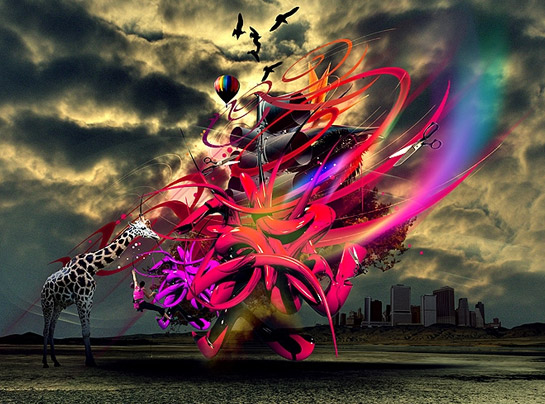
http://www.changethethought.com/blog_2008/jiri_adamek_pseudo_pseudo.jpg
I like this collage because of the surrealism feel towards it, the use of bright pink to purple colours also make it quite colourful against a dark landscape. I am not fully sure how this was edited in photoshop, but I believe that city in the background was made smaller, then added a layer mask to get rid of any unwanted bits and then edited with colour levels. As for the colour coming of the Object in the middle, I believe it was a brush with a low fill setting on a seperate layer. I am not sure how the rest was done.

http://i.ytimg.com/vi/ierX9YQDFvM/maxresdefault.jpg
This one is similar to the one I did for spring holiday for homework. I like the polaroid design, as it has a sense of vintage style. This was created by creating a clipping mask using the original image as a duplicate and a black square, which gets transformed into the image because of the clipping mask.
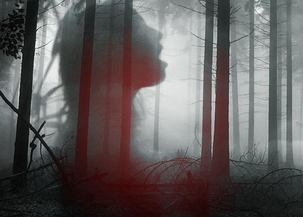
https://m1.behance.net/rendition/modules/18075904/disp/1b4e81ccd6ce93a512c22f366189f88b.jpg
I really like this one for the smoke effects used within it. The red glare is created from an overlay of a simple brush stoke that lays on top of the image.
Nature Collage Design
I had been tasked with creating a collage from images that I would take. Firstly, before I do that I must do some research into some existing collages of nature.

I have created this mood board to give myself a general idea of what nature collages look like. These collages share a similar ideal that green colour, represent nature. Pink and reds are also used among these to show the colour of flowers or butterflies. White space is a common use within these collages and many other collages. This is what makes some of these collages look professional.
For my first collage test I had created some shapes in illustrator and imported them in, but before I did that, I first got an image I took and made it monochrome. Afterwards, I put some dark edges around the corners to draw your eyes towards the middle.

For this collage, I had used two images that I had taken, one of a tall tree and another of concrete, which gives the image a vintage feel towards it. I had created this by using a 'colour burn' on the concrete texture that I had gotten.


Womad Festival Research

http://www.marcbessant.com/blog/wp-content/uploads/2011/03/poster03.jpg
The first thing I notice about this poster is the logo for ‘Womad’ has been altered to look like a cloud, this works especially well with the background colour chosen, as we would think that the poster is of the open sky. The white space helps direct the eye towards the cloud and makes it a better poster overall than if they put several clouds in the background.

http://www.marcbessant.com/blog/wp-content/uploads/2011/03/Womad-zoo_poster.jpg
The use of black and white with a shade of blue in this poster makes it work well to direct your eye towards the centre and allows you to see the tiger made from smaller animals. Seeing this first would make you think that the poster is related to animals and if interested, would make this a successful poster already, as the poster is based upon the Womad Zoo. The detailed information is displayed in a different colour to direct your eyes away from it.

https://s-media-cache-ak0.pinimg.com/236x/38/c5/65/38c565215425ae3694dab2884dd9b04c.jpg
This poster is very effective at getting its message across that ‘Womad’ is a festival about different countries people coming together by displaying differently countries in segments within the logo of the festival in order to celebrate a certain subjects, which could be: Music, Food, Reading, Zoo animals etc. This logo has been set in the place of where australia is.

http://www.marcbessant.com/blog/wp-content/uploads/2011/03/poster06.jpg
This poster uses flowers, as inspiration to create a musical form out of them by turning them into speakers of a music box, in order to suggest to the viewer that this poster is music related. This festival appears to be displayed in what appears to be a traditional gazebo/Circus type structures, which suggests that this event will be hosted in country-side area, which would be appropriate for the summer for when it is set. The typography reminds me of text used in circus posters. Circuses are seen as generally fun things, so it would help sell the poster to use text that reminds you of it.
https://m1.behance.net/rendition/modules/6899503/disp/b0796a09675a97eb5f21cb8b3967d520.jpg
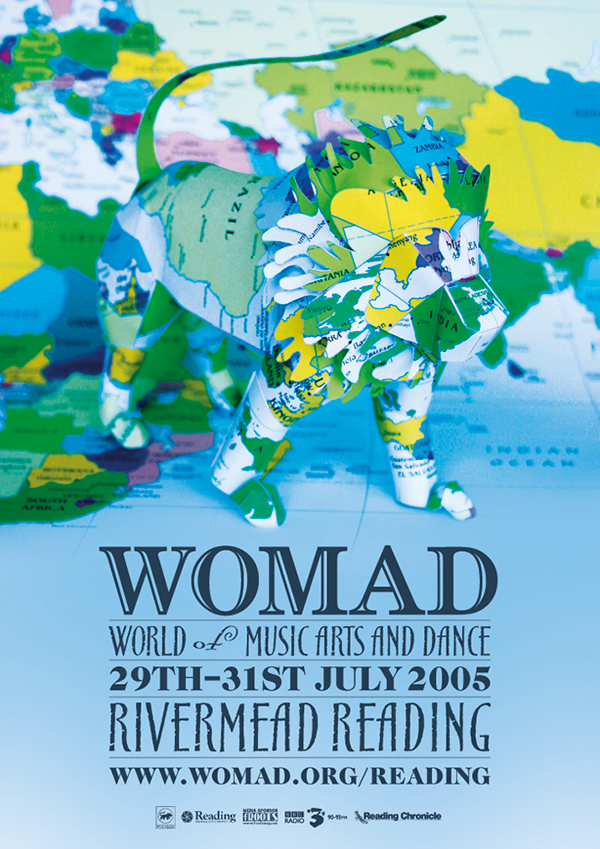
This poster is very clever in it's use of 3D models, as someone has created the Womad logo out of card that has the texture of the world on it. This would help suggest that Womad is a worldwide event and supports all cultures to come together at this event. This event appears to be a reading event and the origami lion helps keep that relation to books as it is made out of paper.

http://www.kryztoff.com/RAW/wp-content/uploads/2011/03/Poster-Final1.jpg
This poster is different than the others, in that, it uses patterns very common in different cultures to bring them together under one logo, this is meant to suggest that Womad wants to bring together different cultures for it's music/sound festival it is having. This poster uses red and yellow together to get it's message out. These two colours stand out well against each other so they could create a strong message within the image. The typography used in this poster is different to the previous two posters that I have reviewed as this text is more informal and doesn't have a link to a certain country, as circus typography would remind me of England and america. The use of erosion on the text makes a great texture, the erosion suggests of long travel, which makes sense for different nations coming together to celebrate music.
https://braveface.files.wordpress.com/2011/03/womad_11bg.gif
This poster uses textures and patterns to get it's message across. Just like the last poster, this poster mixes different patterns from different cultures together within it's logo to suggest multi-cuturalism. Things are falling off the lion such as, violins, animals and food to suggest that Womad isn't just about music and that they express a multitude of things.

http://www.communityni.org/sites/default/files/images/womad_-_21s_june_poster.png
This poster is different in style to the previous posters, in that, it appears to be more art orientated and stylised more for children. The poster uses a blue colour scheme along side a colourful title to help get the attention of young children. The Womad logo is chosen to be less important on here as I believe branding is not important for their target audience until they arrive to the actual event, I believe they want their poster to be interesting and cool.

https://13thflooroffice.files.wordpress.com/2013/10/womad-poster.jpg
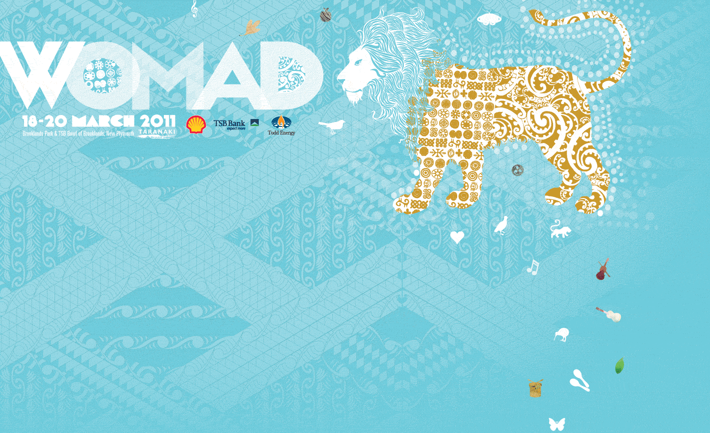
I really like this poster because of use of gradient colour and patterns. This captures my attention instantly for something that appears to be international an culturally inspiring. The use of pink and silver work very well together to focus your eyes onto the important parts of the poster, such as "Turning 10 in taranaki". They want the audience to know that they're celebrating 10 years of the world festival with patterns inspired by the area of where it is being hosted.

https://blogger.googleusercontent.com/img/b/R29vZ2xl/AVvXsEgoCeTLNf5C5ERZMjKiAer9vsCWcj0dEVEvmD1fKEVwHal2kmO_jv4Bw-z91GLUDOKtN3aUIqN1CHD0Uv5jjRaEz-68UeHs-gFWCLI1fRzMm5n5n85vyufyjzvLv96yKXULo95N16v80IzI/s1600/Screen+shot+2011-01-13+at+14.20.30.png
This poster is minimalistic, but yet very appealing due to it's glass like look. It almost looks as if layers of different coloured glass were placed on top of each other to create this origami bird shape. The type face used is quite unique and smart as it uses a bold text alongside cursive. It almost reminds me of similar olympics typeface.

http://www.bigfish.co.uk/wp-content/themes/bigfish/timthumb.php?src=http://www.bigfish.co.uk/wp-content/uploads/2013/02/womad_poster.jpg&w=680
This poster has a surrealist - vintage storybook feel towards it and reminds me of Roald Dahl stories. The typeface used appears to be handwritten, which relates to the storybook style. The use of blue in this gives it really calm and relaxed feel towards it. When looking at this poster I get a feel that the event may have this slow, relaxed feel towards it.

http://abudhabiliving.net/system/files/womad.jpg
The use of colours and shapes within this poster reminds me of arabian culture, due to the languages text and that also these colours are used frequently for advertisements of that culture. The green used in the background isn't very appealing to me, but I know that this works a lot better for people of other cultures and countries.
Typeface Moodboard

Here are several typographic texts that I had picked for use in my poster.I wanted to look for something similar to what the existing Womad posters use, for example Shadow Serif text looks a lot like July 2006 Womad poster above, but I had also included several new fonts as well that I may want to try. I had tried several fonts above on the test design for my final two posters, as you will find below.
Cutural Moodboards
Before creating my final piece I had to do some research into other countries patterns and culture, so that I could possibly gain ideas that would affect the outcome of my final idea. Looking at individual continents allowed me to open my mind to new styles and different ways of thinking, due to how different thing are compared to myself and the country that I live in.
Asian continent.

Australian continent.

African continent

South american continent.

Sketch designs
For my poster idea I had come up with the idea of creating a series of posters which make up for one advertisement campaign final. Each one features a different colour and flags of different countries.

For other poster ideas, just incase I was unable to create my last idea, I had came up with a saxophone, which had flags exploding from the exit. For my other idea I had thought of the Womad logo singing with musical notes coming out of it's mouth.

Final posters
For my final posters I had decided to create several music based instruments as it's theme. For my first one I had created someone with a Microphone. The idea for the poster, was to have a multiple of different nations flags onto different instruments. This was to imply that any nation has the ability to create music and that they can all come together to express it to others.
I went through several design changes when creating this poster, starting off with the typography used, as I felt it did not fit the genre of the event. I then tried different textures for the background of the poster, but I had felt that they were too strong on the eyes, so I discarded them.


By this point I began having a structure for how the final piece would look like.

This was the end result of the structure for the poster, but I had felt that it needed some changes to typography and positioning so I had began experimenting with different ones.


This became my final design for the first potential final outcome.

I then began to progress onto my second posters, which I had an idea to use layers masks that I had learned about during this unit to fill the grey areas you see below on the drum kit, by using Photoshop's Edit > Paste Special > Place into, I was able to fit flags onto the drums without any need of editing onto the images themselves.

For this I was going for a very similar design to last poster, but I made a few changes to colour so that when both posters are shown they can appeal to different audiences.


I then went through different design changes to font style and positioning like last poster, to make the poster more effective to it's audience.


Using the same technique I used for the drums I was able to create flags coming out of the saxophone with little editing needed.


Final Design Showcase


Final collage Proposal
For the final assignment I was given a brief that explained that I would have to use my knowledge from my previous research and development from this unit in order to create a final collage. Below is my initial proposal idea for a collage.

12 collage reviews

This is an art/collage piece created by Alicia Buelow. He uses a series of overlaying and colour effects to get style he is well known for. Here is a photo of charles darwin with some overlays of works he had worked on. the overall effect is supposed to give off what this man has done in his life and what he is known for. The use of green and brown represents decay or vintage style, as as paper decays it becomes brown and this collage are based around Charles Darwins notes around the Human Evolution.

This is another piece created by Alicia Buelow, as you can see his signature style of old paper with over laying text documents. Buelow has a talent for making his collages look vintage and surreal in some aspect. This collage appears to show me that Buelow wants hope for ravens to longer be captured, that is what I feel when I look at this, because of the traps in the bottom left corner with the words "See past" and "Hope".

(http://altpick.com/aliciabuelow)
The final piece by Buelow I decided to study, this piece was called "The New Innovators, Web Techniques Mag".This piece combines old photos with photos from modern technology. A lot of the text shown within this image show some type of computer technique, such as, coding or Hypertext URL's. his styles is shown here and it seems to be really effective for a surreal effect of someone's background or something that someone had worked towards.

This collage is effective as a panorama collage, as it combines old traditional with modern Japan. I can see a technique in this collage, which I have used myself before, The Japanese Flag has been set to multiply blending to allow it to bleed into the background image as you can see here. The traditional pieces on the sides look as if they have been feathered into the image. This piece has an artistic value to it that is not found in the European Area, so it is nice to see something different.
(http://41.media.tumblr.com/505e0244f066e486a878aed0009fbc6d/tumblr_nic1epOnCi1u4iebho2_r1_500.jpg)
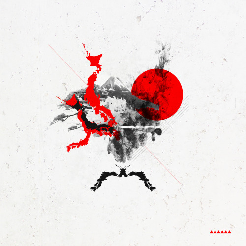
This collage is a lot different to the others, as it primarily uses white space to draw your attention to the image. There's a pattern to this image of overlaying Japan's shape over itself to create objects that make you think. The use of monotone and red, which comes from Japan's flag, is really useful to display the message of the collage and helps you instantly think, that it is about Japan.
(http://farm6.static.flickr.com/5329/14128481661_145bb57029_m.jpg)
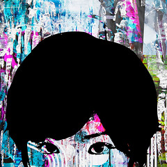
This collage features a half face simple stencil person with many overlapping colours. This has a very urban feeling towards it as that colour overlapping reminds me of poster stands after which many posters have replaced the previous, as it leaves this kind of effect towards it.

(http://macaulay.cuny.edu/eportfolios/bernstein2012arts/files/2012/12/Gateway-into-Japanese-Culture.jpg)
This collage is a very simple one that primarily uses just overlapping images over each other, but I notice a drop shadow behind the Shinto shrine, which makes me believe that it is the focus point towards this collage.

(https://s-media-cache-ak0.pinimg.com/236x/d9/94/7f/d9947ff5cebf705b27687cca0b56fb9b.jpg)
This collage has been skillfully made by overlay lots of images to create one big image. This has a huge surreal effect towards it and inspires to create more art like itself. The green background works well with the floral design along with the cut outs that are green. This brings out a nature like feel towards the image.

(http://cache1.asset-cache.net/gc/495798189-collage-of-kyoto-japan-gettyimages.jpg?v=1&c=IWSAsset&k=2&d=7ZwLwkEI9AThQVWgA7fJeutWuIWFRM0bUJ19SkTjkfK%2Bk%2FV2y252avgzXgscbEQV)
This collage is very interesting as it uses a range of different textures and patterns to display itself and it has quite a effect on the user. This collage has an effect as it tries to show you a small ammount of what Kyoto has to offer, which include; Geisha's, Trains and Shinto/Buddism religion.

(http://www.vintnersgroup.com/Collage/collage%20-%20seattle%20japanese%20garden.jpg)
I really like this collage, as I have had the experience of creating one just like this one. This one inspires me to create more due to the effect of nature this one gives off. The polaroids are created by using a simple black square as a clipping mask for the target layer you want to be within the polaroid and then adding a white border on top of it.

(http://maxcdn.thedesigninspiration.com/wp-content/uploads/2010/04/marumiyan/Marumiyan-002.jpg)
I find this collage very interesting due to it's style of stencil along with paper texture and vibrant red colours. The collage is very artistic in style in the use of overlapping and visual style. The creator has stuck to three colours when creating this, as too many colour will overflow the image and be too much.

(https://s-media-cache-ak0.pinimg.com/736x/58/ed/b9/58edb9f69c0ed7c27914397b70e5a913.jpg)
I really like this colour because of it's effect of overlapping Japanese newspaper articles over the top of a drawn Geisha. This has an impact due to the way that is is overlaying, as it makes it feel like it has an important stance.
Researching books from local library
After giving my view into twelve collages I decided to do some research into pre-existing materials that where kept at my local library. I had found two books when searching into their database 'Japan design' and 'Package design in Japan'.


Unfortunately, when I went there to collect both these books, I could not find them and I refereed to a librarian, but he said that they must be missing, as he could not find them either. On the positive side I had managed to find a book called "Manga: Sixty Years of Japanese Comics". The book had lots of useful materials that would become useful in the final collage.


I had also brought in books that I had collected from home as well that had relevance to my collage ideas. These could become useful for overlays on my collages.

I had created a moodboard to show the kind of scans I had taken from the books.

I then began to work on ideas I could create for final collages and I had came up with three. One of my ideas featured a corner of a castle mount with the Japanese flag near the top-middle, with additional scans on the sides. For my second idea I came up with using a super huge kanjii "私" , which means "I", "Me" or "Myself". I wanted to do this to show what that the idea behind this was of me and my love for Japanese things. For my last collage idea I thought about combining multiple items that make Japan Japanese and then overlay different scans over the corners of the collage.

First collage
I started off with drawing the word "私", after post production of the final collage I have come to realise that I had drawn the character wrong and have missed out two lines on the first symbol, this would have effected me in the very end design if I had stuck with keep my hand drawn character.

I first changed the levels of the scan so that the character stood out more, so that I could effectively blend it with other layers.

I then began overlaying scans on top of the character.

I then used a blending mode called exclusion to get a weird see through effect.

I then began putting together a series of scans, but I had not liked the effect it was giving off so I began to start again I try different methods in order to achieve my idea.

I used my Japanese keyboard to write the character and had placed it in the desire area that I wanted it.

As before I began overlaying scans, but then used a layer mask so that the scans would only show up where the word was.

He is the desired effect that I had wanted, by using a layer mask and selecting the area I wanted to only show up.

I then began overlay other scans on top of each other to get an overlaying paper effect.

I then did the same for the other part of the character.

After finishing the overlaying effects on the word, I began editing the background, by creating a red circle to represent the flag of Japan. I put this red circle on the blending mode of multiply, which wont take effect until later on once there are things behind it, so at the moment it is just a plain red circle.

I began applying a darkness effect to the top right corner to change the colour of the circle and to also change the focus point of the collage.

Using images I had taken from an earlier project I had put a sun flare behind the circle to give the circle a texture.

I then got the scan of the incorrect "" and then used it as a underlay for the red circle, which had brought out an effect that I did not think about and I liked it enough to keep it in the final collage. I then applied a background image and changed the opacity to 80%

Final First design

second collage
For my second collage, I had gotten a image of a castle of off google and had place it in the centre of the collage.

I then turned the image black and white to get an plain effect, which I later on modify to make it of a collage.

Using the same technique on the previous collage I created a red circle at the top-middle of the collage and applied the blending mode of multiply to get this desired effect.


at this point I began putting in some scans and cutting out parts that I had wanted to use that could overlay the image. By using the multiply option I was able to make the white background of the paper scan see-through allowing it to keep the immersion.

Here I placed another scan, using the same blending techinques, within the circle.

Using the feather toll I was able to cut out parts of other scan I got and blend them into the original image with a soft edge rather than a sharp edge.

I repositioned the scans at the bottom to work in line with the castle's perspective to give an illusion on the eye.

I had felt that the left side of the image was too empty, so I had repositioned the 'Gundam' scan and put in another scan near the middle.


Design report
For the brief I was tasked with creating several
poster designs for a client in a professional manor. I would have to provide
step-by-step process of what I did to show my knowledge of the design process
and provide the client with professional designs. Afterwards I would have to
produce two final collages based on a subject of my choosing. This allowed me
to brainstorm ideas on what I could create.
The brief stated that ‘WOMAD’ meant “WOMAD was a world
music and dance festival”, which had given me great ideas on what I could
produce and I had begun already creating prototypes, ready for the end design. When
briefed about the final collage assignment, I had considered several different
ideals for what I could produce and after thinking about it I had finally
decided to make the subject about Japan.
When I started the ‘WOMAD’ assignment I knew nothing
about them, so I needed to do some research. I began by reviewing twelve different
posters that they have already created to get my mind fixed about the kind of
style and ideal they have for their posters. Afterwards, I began creating mood
boards on patterns from continents around the world. I believed this would help
me think of ideas near the end of the research process.
Before doing this assignment I was taught many
different techniques in Photoshop that would allow me to get many different
outcomes. Most of them had helped me create a better design overall. These
techniques include blending tools, Feathering and image manipulation via the filter
panel. My initial idea for the ‘WOMAD’ assignment was to create a series of
posters for one advertising campaign, which would feature every member of a
band on individual posters. Evidence of this can be found within my ‘WOMAD’
designs. I had felt really good about this assignment, as I had thought of
ideas instantly, which I believed were achievable ideals. I had also felt
really pleased with the final outcome of the posters, as they were
minimalistic, but still very professional and I had thought that they would
work very well in a business environment.
If I were to do this assignment again, I believe that
I would invest more time into the development stage in order to finish designs
that I had envisioned. I would also use more inspired designs from
international patterns rather than a minimalistic style. I believe this, due to
the minimalistic style not having much relevance to ‘WOMAD’s previous work.
After finishing the ‘WOMAD’ assignment I was tasked
with creating my final college, which I have mentioned before. As said before,
when briefed for the final designs I had spent some time on what I should
create. I had some trouble thinking about what I make my subject, but after
some hard thinking a finally came up with Japan being the main subject around
the collages. This had wasted a bit of time that I could’ve spent designing
prototypes, but I needed the idea before the prototypes. For this, I had
revisited many techniques I had been taught earlier in the year in order to
successfully use them within my collages. The techniques that became the most
useful were the blending techniques of ‘Multiply’.
When given this assignment and finding out that I
needed to create two collages, I began looking online for twelve pre-existing
collages, on which I could review and give my opinion on how I believed they
created their own collages. Afterwards, I began researching a local library to
see what resources they had related around Japan and Japanese things. I had
found when arriving at the library that the books that I had wanted had been
lost by the librarians, which had set me back by quite a bit, so I had a look
around the library to see what books they had to offer and have found a book
called “Manga: seventy years of Japanese Comics”. This book became very useful
and had offered a lot of resources that I used a lot in the final outcomes.
I had also used two books that I had at home for
additional scans, but these books were not as good as the ‘manga’ book. When
getting around to creating the collages, I used a series of layers masks and
blending tools in order to get my final outcomes to look the way that they do.
Without learning about these techniques earlier in the year, it would have been
near to impossible for me to get something near to the same outcome.
If I were to do this assignment again I believe I
would spend more time into collecting images for my collages, as the amount I
had collected was simply not enough or was not of a variety for me to create a
difference in each collage. After all my learning, my research to both
assignments and then my final outcomes I believe that my work is achievable of
merit or higher standard and is of a strong merit, due to the extensive
research and development I have covered.