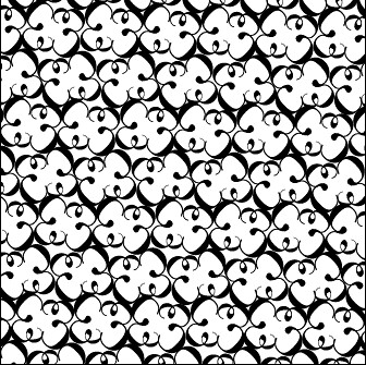
Type Patterns
During this lesson we were shown different examples of type patterns, as shown below, that might inspire and help me create my own style of type patterns.
 |
| Example - https://c1.staticflickr.com/5/4066/5096986261_17959b0a88.jpg |
Below is a series of designs that I had created, with my best being on the second image. I had liked using 'I' with the typography I had found, as it created many interesting shapes for example the design that look similar to a pair of scissors. 'M' and 'T' also came out with some interesting designs, which had allowed me to come up with similar ideas and create more patterns.


Expressive Typography
After creating different types of type patterns I then looked onto expressive typography, which I did not know much about so I created a mood board with my research on it, upon looking at it I could see that people create some expressive typography based on what the word is. As you can see from the word "Delete", you can see the the letter "L" is missing, which means that it has been deleted.

I began designing my own expressive typography based on 5 words, which were given to me at random by another student in the classroom. This allowed me to try words I was no familiar with or words that I need to take time on to think how I could turn it into expressive typography. The words I had been given were "Pizza", "Speed", "Spooky", "Dystopia" and "Time". Below are my ideas for how I could represent them in an expressive way. Picking one design from the 25 designs I have created from each word would allow me to have 5 final designs to work on and attempt to make them expressive.


In this design I had attempted to create a clock design with the word "Time" having each letter pointing at each 15 minutes to create the clock style. To do this I had just created a text box for each letter and placed them correctly using a grid on the clock hours: 12, 3, 6 and 9. Out of all my designs I like this one the most as I think it effectively shows off time being displayed. Other designs had used shadows or the efficiency of human life to display time passing.
 This design was an attempt to show off speed through moving letters. To do this I had written the word and then used an envelop warp changing the horizontal distortion of the word in order to get a italic style. This style gives off the feeling the the words are possibly moving as the height in the letters are different the further along the word. I felt that this was my most effective design, as my other designs consisted of; the letters having a race, falling letters and "speed" in the shape of vehicles. I felt that these other designs would not be as effective as this one as they may not give of the feeling of motion.

With dystopia, I attempted to make it look like a city within a bubble, as dystopia's are usually known as broken civilisations that do not know about their outside world. I had tried two different font type on this word to see which would work better and I believe that 'Helvetica' version came out better than the 'Greenwood' version.

 With this word I had attempted in making the "OO" in "Spooky" look like a face, by doing that I would make the "O" look scared, which would support my expressive typography. I had used the letter "Ö", which comes from latin in order to create my faces. In my opinion I like the 'Greenwood' version rather than the 'Helvetica' version.
 For the expressive version of pizza I had come up with two different ideas, which I believed to be very good. For my first one I had created the word "Pizza" in the slice shape of an actual Pizza and as for the second I wanted to create an almost full pizza with a slice missing to make it look like someone had eaten it.
Graphic concept
After creating several designs I then moved onto creating a graphical concept, which has some life meaning to it, possibly from a famous celebrity or something important that needs to be remembered. Like the expressive typography I had created 25 different concepts for a final design for 5 pictures.


 This quote I had based off of a saying within a game called "Metal Gear Solid". The message behind the sentence is that strong men make their own future come true by doing what they believe rather than attempt to predict the future and possibly fail. The design on the left is not expressive like the one created to the right. I attempted to make the design on the right look like text within a book, as for the left design I made the most important words in bold for people to understand the meaning.

For this design I had used another quote from the same source, as this game has a lot of life inspiring messages hidden within. The meaning behind this is that, the past and future work together as a single entity, as humans learn from their mistakes they can progress into the future. For this design I attempted to make the past look like it was behind so I had put it on the left side as the the future on the right side having them connect together by being "One in the same thing". As for my design on the left I had attempted to create the same thing but in a different shape.


For this design I had an idea to use MLK's speech, as it is a speech that is extremely famous around the world and still fights for racial equality even to this day. For this design I had chosen to use images of Martin Luther King and of the location where his speech was set to show what my sentence was related to. I had change the colour of dream to brown to represent MLK's dream of equality around the world.


In this design I had used a quote from "Metal Gear Solid 2", which means that there is more to life than passing on DNA, with the birth of the digital age, leaving history through books, speech and the internet is easier than it used to be since everyone has access to it. For my first design I attempted to create a DNA Structure to be able to get the message across and for my second design I chosen to put life at the top in green, because life is a precious thing, and DNA in blue, because DNA is often referred to being blue, at the bottom to simulate that the DNA you have doesn't hold you down. I put a lot of emphasis onto the word "Just" so that the viewer can understand the message behind the sentence.
(Source to idea)


For this idea I had created the sentence myself after being inspired by the other designs that I had created. I had tried to express the broken expression into this design by having the sentence broken off and also the word too. I've change the colour in both of the designs to white to indicate the message behind the sentence, so that people can understand it.
Visual Recipes
After finishing the Graphic concept assignment I then moved onwards to visual recipes where I had to think of a recipe that was not too easy or too hard to make and make a digital art design out of it. I had chosen to do 'Strawberry cake' for my design idea, mainly due to the way they look and the colours within them. Below I have created a mood board of strawberry cakes for research purposes and so I can refer back to the mood board if I need to.

I got a recipe for a strawberry cake on the internet and began finding pictures of all the ingredients and put them into a mood board so that I will be able to recreate them graphically later.

I had also done the same for the equipment needed to make the strawberry cake.

I then created a mood board for everything associated with strawberry cake, which comes from the united kingdom. Things that are most commonly know about the UK is, Tea, crumpets, the Queen, castles, Great British flag, fish and chips and many more.


After doing research about how strawberry cake is made I went onto "Dafont" to find appropriate fonts for my design. For my design I wanted it to be quite Gothic for text alongside background colours that match the colour scheme, which will be pink, red, white.

After choosing my specific font I started to create some digital designs for the main poster on how to create Strawberry cake. Below are item that were from the ingredient and equipment mood board that I had used for research in order to create these designs.


This is how the design looked before adding a background into it. I had put in the instructions on how to make a Strawberry cake from the top-left to the bottom-right. These instructions match the instructions from the mood board that I had created, but to a more visual level.

This is my finished design with the background that I wanted to add. I believe it makes the design look a lot more appreciated by the viewer rather than a plain background, or a image of a strawberry cake.

Alternative designs
Here are some alternative end designs that I had created so that I was able to play around with how the design worked and if it was better, then replace it from the original. I had tried different styles and seperation methods on the design to see if it would look better. I had also attempted to use type patterns to make the design look better by creating them as background designs.


Festival poster assignment
Festival poster assignment
General Visual posters

General Typographic posters

Posters related to my festival

Past posters in Bristol

Festival name idea generation
Before creating my own design I had to first think of a name that would fit the festival type. I combined possible words that relate to both Japanese anime and festivals and had come up with three names; Japanime, mangafest and my chosen title Genki-DesuFest. Although "Genki" in japanese means being healthy/ feeling well, I hope to deter it away from the meaning and make it its own branding name for a potential festival as most western viewers think of anime when they think of Japanese language, which could help persuade the viewer better.

Handmade typography
I began creating some handmade typography designs for the poster, I had followed some designs that I had found online for inspiration, but had changed them so they were not the same. The best one of these is the first one, as I believe it follows closely to the anime style. Other designs came out quite well, but had not met my expectations for what I believed fit the style.

Related typography

1. This is my favourite out of the 12 different styles that I have picked for potential use in my final designs. I like this one as it closely represents the Japanese anime typography that is used within manga and Japanese anime, which most viewer would recognise if they were to see it on my poster.
2. This typography is very similar to the first, but it is much sharper and less bold. This could potentially be used alongside the first typography for smaller less important information listed, because of their similarities.
3. This typography simulates closely to the past two, but features a calligraphy like style to it, which is stereotyped to Asian culture, so it would be useful to use it, but I feel is too thick to be used on a poster. This type of text may be useful for small forum headers or on business cards as it is quite small text.
4. This typography follows a similar style to the fourth typography in its calligraphy style, but offers a lighter brush, which attempts to make the text look more realistic to how calligraphy would look if it were drawn lightly.
5. This style follows closely to that of calligraphy, but also has some tradition western elements to it as well, as you can see on the 'D' letter it has that flick on the end of the letter, which is stereotypically found in western history shows based around the time of the Tudors or possibly further back.
6. This typography features a Japanese language type of style as the 'E' is replace with that of 'Mo (モ)' in Japanese Katakana alphabet. This typography could be useful to those who know Japanese, as they would recognise it and become nostalgic with their Japanese learning, which would intrigue them into reading. Unfortunately the letters in typeface are of different sizes, which I believe makes it less effective.
7. This typography is similar to that of sixth, but the height of the text has been fixed in place so that different parts will not big bigger than the others. This style also uses katakana alphabet to make it seem more Japanese and have that sense of nostalgia.
8. This typography seems to be more modernized than previous typographies, this style features sharp edges on certain letters in order to make itself look more important. This typography has no connection to any Asian stereotype or similarities to Japan, but offers a professional look to it that could be useful, but more likely to possibly a music poster.
9. This typography appears to look like calligraphy as well as also being sharp like a blade, which I believe the creator was trying to get across, as this typography was called 'Hara-kiri', which is to do with Ancient Japanese culture where one would commit hara-kiri with a blade if they were dishonourable or captured by enemy clans. This typeface would work well with a ninja or samurai graphics placed closely to it, so that it would be recognisable to the reason I chose the typeface.
10. This typeface has large thin font, which each letter bends into a shape that only a brush could make. Making this font closely resembling calligraphy, but is different to the other styles I have mentioned due to the way this one has been created with it's wavy lines.
11.This typography tries to combine east with west, as the name 'Samurai in the UK', implies, by attempting to combine calligraphy style with London metro style. Unfortunately I have some doubt about this font working well on my posters, as I feel it is not attracting enough to pull the attention of the audience.
12.This typography is very similar to the other calligraphy fonts I have spoke about, but features differences in it's edges, length and style.
Poster prototypes
I had designed six different poster prototypes that could work as my potential final design. In these designs I had tried to incorporate slanted titles, as I feel that it would follow some previous anime titles and I believe it would be found cooler to people who like this style than not. I had attempted to use some of these prototypes in the final design, but some did not work as well as I thought.

Final poster Development
For my first poster design I had chosen to use a spiral design for my background, so first I had to open a new photoshop file of 75x75 pixels and create two different colour that would work well against each other. For this poster I have chosen to make it's colour scheme red, white and black, due to the idea I had thought of. I had to rasterize the two colours and then turn it into a pattern from where I would use it in my poster file.


In the poster file I had to select the entire canvas using the marquee tool, right click onto it and then click the fill button in order to use my pattern.


After applying the pattern I then wanted to create a spiral, so I first used the polar coordinates filter to make the pattern point towards the middle. I did this so that when I use the twirl feature it would create a spiral that points towards the middle, which would make the viewer of the end design look towards the middle first.
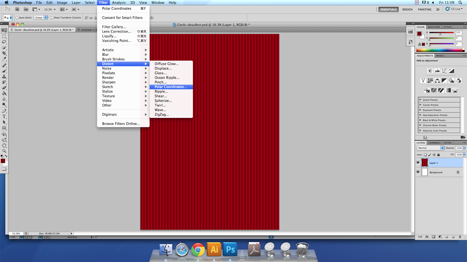


Using filter, distort again I was able to use the spiral feature, which would allow me to twist the current design into a spiral.


I began creating characters for the posters, as I did not want to use copyrighted characters because this could have lots of technical implications further down the line after creating the posters. I believe it would be a lot easier for me to create original characters on the front of my poster than using pre-made ones, as this could show originality and possibly inspire others into creating art.


After deciding on what text font to use, I have chosen to use 'Anime Ace 2.0' for the title and 'Anime inept' for the slogan, as I believe that they suit the genre and give off an anime like feel to it. Using back shadows and outer glows I had managed to make the title stand out a lot more compared to the other text.


I had started adding shapes, shadowing, images and information onto the poster, but after sometime of designing and reviewing I had found these shapes to take up too much space and may be too much for the viewer to take in all at once, so I scrapped this design and had gone back a few steps to see how I could improve it. With this design I wanted it to use visual images to try to persuade the viewer to come to this event, by letting them see what the event looks like and also allowing them to see what special guest were going to attend the event.

For my first poster design I had chosen to use a spiral design for my background, so first I had to open a new photoshop file of 75x75 pixels and create two different colour that would work well against each other. For this poster I have chosen to make it's colour scheme red, white and black, due to the idea I had thought of. I had to rasterize the two colours and then turn it into a pattern from where I would use it in my poster file.
In the poster file I had to select the entire canvas using the marquee tool, right click onto it and then click the fill button in order to use my pattern.
After applying the pattern I then wanted to create a spiral, so I first used the polar coordinates filter to make the pattern point towards the middle. I did this so that when I use the twirl feature it would create a spiral that points towards the middle, which would make the viewer of the end design look towards the middle first.
Using filter, distort again I was able to use the spiral feature, which would allow me to twist the current design into a spiral.
I began creating characters for the posters, as I did not want to use copyrighted characters because this could have lots of technical implications further down the line after creating the posters. I believe it would be a lot easier for me to create original characters on the front of my poster than using pre-made ones, as this could show originality and possibly inspire others into creating art.
After deciding on what text font to use, I have chosen to use 'Anime Ace 2.0' for the title and 'Anime inept' for the slogan, as I believe that they suit the genre and give off an anime like feel to it. Using back shadows and outer glows I had managed to make the title stand out a lot more compared to the other text.
I had started adding shapes, shadowing, images and information onto the poster, but after sometime of designing and reviewing I had found these shapes to take up too much space and may be too much for the viewer to take in all at once, so I scrapped this design and had gone back a few steps to see how I could improve it. With this design I wanted it to use visual images to try to persuade the viewer to come to this event, by letting them see what the event looks like and also allowing them to see what special guest were going to attend the event.


Returning to this design I had thought of ways on how I could improve it to possibly make it better for the viewer. I had come up with the idea to put important information about the event into the swirls. Doing this will make it more viewer friendly or more lightweight to read. I had started again with shadowing by putting it in the corners and also on the edges, so that it will bring the viewers eyes towards the middle.


For the date, I had wanted to make sure that it would be on a weekend in the summer season, so I had checked my google calendar to see what days would be useful to put down. I had chosen to June 19th to June 21st 2015 for my event date as that date would be most people's day off, so that the event will have a higher visitor count, boosting profits for the event if it were real.


After completing the final design for the first poster I had then run it through several colours so that I could see which colour works best with this design. I could also do a questionnaire finding out what people think is the best one. Using this data would allow me to choose which of the design I should promote in order to get the maximum amount of viewers having a look at this poster.

After finishing my first poster and was overall pleased with it's presentation, I moved onto the second poster. For this poster I wanted to use a different design than spirals as I want the posters to offer an experience to a variety of people. Instead of spirals, this time I had used a gradient background in hopes the would attract a different group of people than the first poster. I had tried several colours for backgrounds, but I had not been happy with how they merge with each other and had finally agreed with a white and blue background.


Using the character I made earlier, I had applied it to the background alongside the title, date and location.

I wanted to add important information to this poster in the form of the background, but I had found this text too bright and felt that it would attract the attention of the viewer first before they see the character design and title, so I had changed the opacity of the text to quite low, so you would see it after reading for some time. I had then added Japanese text so that viewers would associate it with something Japanese. The japanese text reads "Genki Desu Fuesuto(fest)".


I had then began moving about the layers, as I had felt that there was too much free space where I could potentially move parts to look better. I then made changes to the colour of the word "Desu" for it to stand out more to the viewer.


After finishing the final design to this poster I had ran it through different colours just like I did for the first poster, so I could see which look better in other colours. Looking at these six I do feel like some work better than others and they have a lot of viewing potential. Doing a questionnaire to find out which one is the most popular to the general public in order to maximise viewing potential.

Final design before error


After creating these two designs I had realised that I had made a spelling mistake on the location, for where the event would be. This had effected my entire design cycle, this is where I would have to start the cycle again and start from the start. I had also make slight change to the placement of the date on the second one to match the first so that there is a slight similarity to them, which will help the viewer recognise the branding.
Final Design After Error


Design Evaluation
Unit 04 – Communication through Art and Design
Liam Norman
http://liam6478.blogspot.co.uk/
For my poster design I had chosen to make them based on
anime festivals as they are really popular within the western world, having my
own experiences of going to one, I know what to expect when arriving. This
allows me to have a grasp on how anime festivals are meant to look like and how
they are advertised to the audience. Also liking the types of festivals allowed
me to keep motivated whilst creating my own designs and doing research.
During my research I had identified the following visual
aspects about Japanese anime posters: Most use bright colours or colours based
on the characters displayed on the front of them, they provide information
about certain events that are going to happen within the festival, some posters
show important special guests in order to persuade people to come to the
festival or display popular characters from new anime depending on how old the
anime is. These are several points that can be considered when creating a
poster. I had researched several companies who produced posters of anime, such
as; BCE (Bristol Comic Expo), MCM (London Anime exhibition) and ‘AnimeExpo’. To
make an effective anime poster, I have to consider the following; use of
colour, use of characters, white space, the spacing of font and objects to make
sure that the poster is not overwhelming.
I produced my poster using Photoshop and Illustrator, I
used Illustrator to create my own original characters that I could use for the
poster, which would have to match the colour scheme. After, I used Photoshop to
create the posters designs using the tools within the program and effectively
use layers in order to display my poster into the way it is. Using these
programs, I was able to improve my use of technique when drawing Japanese Anime
type characters. When creating my
posters I used a technique that I am familiar with, which is, shadowing and
lighting, as I use it a lot on my work that requires Photoshop. I had learnt new techniques, such as, polar
coordinates and twirl in order to create my spiral background. Without these
tools I don’t believe that I could not recreate the efficient posters as I did.
Also without my research into existing anime festival posters, I would not have
the same ideas generated as I created, as I had took into account what other
professional Japanese Anime posters used, such as, bright colours that match
their characters, if they use a character on the front of the poster, Multi-coloured
typeface, use of real life imagery and overlaying.
I believe that my final design is effective because I
have managed to follow the design style that is similar to the other anime
posters currently existing. I have made sure that the posters do follow these
styles by referring back to my research when I was unsure. I have also asked
several people if they believe that my two posters are effective and they have
said that they “do look effective” to the viewer. I have also had a person ask
me about the event because they believed that it was a real thing and that it
looked interesting. Unfortunately I had made a spelling mistake on my final
design, which had cost me my entire research cycle, so I had to start again
with it to show the end design.
If I was given the chance to work on this unit again I
believe I would work on my time management, as I believe that I could have done
a lot more to improve the quality and technicality of my work, as I could of
spent some time doing some questionnaires to find out how effective my
different colour posters were to the general public, which would of improved my
overall work and could of allowed me to make some changes to how it looked to
suit the audience more efficiently. I would also spend more hours working on
this unit, as I had not been committed to annotation work until near the ending
of the unit where I had starting coming on during my free time in order to make
sure that I would meet deadlines, which may have affected the quality of my
work in the unit. Although there are some negatives to how I have handled the
unit, I am really pleased with how my two posters came out, as I see them to be
of a professional standard. If I were to mark my work, I would give myself a merit or
higher due to the amount of precision and research I have put into my work
giving the end result of my posters.