During the event between 29th - 31st of January, me and marios worked on a creating a game. This game was set around a brief that the Global Game Jam had set for us. This brief was to design and develop a working idea for a game based around Ritual, being that the subject was vague it allowed us to come up with a multitude of potential ideas that we could use for our final design.
For me to be able to make myself known to the world as a designer I have to first find out where I can go in order to advertise my work. I already know about websites, such as; Facebook and Twitter are popular places used in order to advertise such work.
Facebook has an option to allow you to create a Facebook page for Companies, Brands, Musical artists and so forth. This allows for those individuals to advertise professional work to the public, where users that are people can like that page to receive updates on the product or company page.
Twitter also gives you the ability to advertise companies to the public also, but the difference between these two social medias is that twitter is used to give the message very clearly, as you only have a 140 character(Letter) limit on what you can post. This can be very useful to give users important updates on situations that may not be easily done on Facebook.
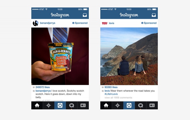
Instagram is also a majorly popular platform of advertisement as it is one of the most popular apps to date. This app is used to advertise on a more casual level when compared against Facebook or Twitter. It has become so effective because of it's use of photography, which does not need explaining and can catch the attention of viewers faster than text.
Other companies like Tumblr are used for smaller scale advertisement or display of new announcements from companies, usually featuring a singular image or several. The unique thing about advertising in Tumblr is that you can add hash-tags in your posts, which will keep them archived under those tags, meaning that if someone were to one day search those tag, they would come across your advertisement. This allows for advertisement to spike in popularity in any point.
Facebook is one of the many ways to get your content out to the people of the world and one of the most popular too, due to the growing user base on the internet, it has become the most successful way to advertise to date. It has been quite useful to use this as a place to display my work, but due to Facebook's policy, I have a slim chance of getting noticed unless I set up an investment into the page via the advertisements you can see in the photo.
Using Redbubble I can put any designs I create onto items, such as: pillows, mugs, laptop covers and many more. By using Redbubble I can advertise my work to others through the use of them advertising by wearing or owning items that my designs are on. Below is a portfolio of my work that I have currently put onto Redbubble, with more increasing every time I make something new.
Below is how an item is displayed onto the website on it's own, for this design I have chosen for the mug to be it's default product, as I believe it works the best on that item.
Game Jam Event
During 29-31 January, me and Mario had attended a local event called the 'Global Game Jam', which is an event that is hosted annually with the specific goal of bringing a group of people together to create a games within that time. The event was hosted in the watershed to where they held a conference to discuss rules and objectives. This years brief was set around the subject of "Ritual".
Several posters were put around the room to give us information on where to go if we needed help.
Me and Marios began working on ideas at this point. We were unfortunate enough to not have anyone join our group, which put us at a MAJOR disadvantage, as every other team had 6+ people within them.
I started off with suggesting we'd make a mind map to come up with ideas based around that one word, I was impressed with the different variety and genre's we'd come up with that we could've branched off of. In the end we had chosen to go with an Aztec ruins as our base for the game.
As the games designer within the team I had begun working up a story that would reflect the area of the game and give us ideas on what we could put within it. At this point I was heavily inspired by the vast amount of potential this idea had, as it felt like it had not been done before and it was something new we could bring to the table.
After we finished the story we began working up so draft designs of what areas should look like and what they could feature in order to get a basic understanding of what we could do. I had the idea that your character would wake up in this vast jungle only to be greeted by a spirit, who would explain that a mysterious thing has happened and that you need to follow the road in order to understand the truth.
Marios had trouble understanding my idea of how you would make it to the first trap because I had explained that you would walk down some steps to where the floor would break, but it visually did not make sense to him, so I drew up my idea visually in order to explain. After showing him the image and explaining again, he understood what I meant and we were able to progress from there.
I had given Marios half of the puzzle rooms so that we could create a fair amount between us and give him access to input into the design of the game. For our first design, Marios had come up with a pressure plate room where you had to find a way to the other side, this was a great start for an easy trap room.
Next, I had come up with an idea of a trap room that would consist of three ways to progress, each way was on another ground level apart from each other, this is purely for the aesthetics of the game to allow the player to look around and look at the walls to look at the detail, but the challenge is still there as times traps go off constantly.
Marios had then come up with a maze puzzle for the user to navigate, at this point we had finally integrated our idea of a point system, which allowed the player to also collect artefacts to gain score. The maze also featured moving walls to change the way the player would navigate, allowing for a different approach each time someone played the game.
For this puzzle I wanted to have exploration and danger zones in the level, in order to get a new level of challenge. This level required the player to climb steps and attempt to jump across platforms in order to reach their goal.
For the final puzzle Marios had it so that the player would have to run across a long platform in order to reach the other side, this level is very similar to the 3 way platform, but is longer and consisted of new traps.
The final room Would consist of the player walking down a long hall that have corresponding pillars holding up the room, when the player reaches the other side, he would pick up a dagger, which triggers a cutscene to where it explains how you got there and why in a flashback.
A photo of marios working on one of the levels.
After the draft designs were done I began working on the first level itself. I wanted to use a strong yellow-orange sun colour to shade the are in order to get that amazon feeling. The image bellow shows the intro to the main menu
The image show the sprite model I had set in place that would explain the intro towards the start of the game. During the start the player would be lying on the floor attempting to get a understanding of where he is.
The character looks to the right.
The character then looks up.
The character then looks left before getting up.
This shows the environment that I had made for the player to roam.
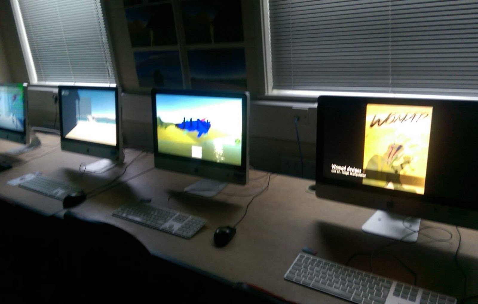
Unfortunately due to the lack of people in our team and the lack of hardware and software, our team struggled to make enough to present, and had not been able to create anything of use. To show evidence of what we had made I compiled a small video showing the cutscenes/main menu and slight gameplay.
Website Design
In unit 64 I had to design a website that would be fully interactive and responsive towards the user depending on what device they use.
Making business cards
Before the upcoming showcase of my work to the public, I began designing business cards that viewer can take in order to get into contact with me about any possible work available for me to take on. Firstly I filled the page with a grey colour and began cutting out small rectangles that would be used as a template for the business cards.
With the template finished I began designing how they would look. I had chosen to use my work from Unit 45 as a background, as I was very pleased on how it looked. I then filled in each space with the image.
With them all filled, I then began putting my information on each one to give a viewer a way to contact me if they are interested in my work. After finishing each one, I merged all layers together and prepared the image for print.
Here's how the final designs look.
Making Showreel
For the public showcase I needed to create a showreel of my best work that I had created over the course of 2 years. Using footage from different Units such as 45, 06,52 and many others I was able to create a diverse range of different types of media that I had created. I hope that when showing this off to the public that it will grab the attention of many, with various questions for me to answer.
Showing off my work to people was a great experience for me to receive feedback from those who have never play video games before or have not experienced something like my work. Feedback ranged from people liking the genreal structure to the game to people finding the game too hard or too long, which is understandable because of the way my final project was structured.
Onwards towards University for the next step of my life at Falmouth, it will be a great progression into the Video Game industry that I have been wanting to head towards. I expect to learn great things throughout the next three years. These past two years have been a great experience for me and will defiantly help for progression in the future.
I began starting this unit with designing some expressive words that I could later create an animated picture to show a descriptive words in the physical way of how they are portrayed.
I created a timeline picture to show how I wanted to create my expressive animation, by using fire to show the change in warmth therefore being related to my chosen word.
I then created a coloured version of what I believed it could potentially look like in the end when I create it.
I finished the animation within flash and it had not come out like I had originally wanted it to. Because I ran out of time I had not been able to refine and make my design more professional an realistic towards how a real fire would work. I believe if I had more time I could do a lot better and have a fully working animation suitable for my ideals.
Infographic Project Proposal Project Introduction
For this project I aim to create a poster and one animated video based upon an infographic of my choosing, as that is what is wanted by the end of the deadline. During the duration of the project I will show my knowledge and development of what I'm attempting to achieve.
Constraints of the project
During the creation of this project there may be several problems that I could run into, for example, I could lack research information on a certain topic or I might lack the skill to create the items to which I would need time to learn. If I do not take precautions towards creating the project then I may not be able to finish what I started.
This project requires me to create a poster specifically for print, so that means I must make sure to not go over the specified size of A3 and that the resolution of the image is clear enough to come out well upon paper. I also need to create a video, so I might take screen size into the upmost consideration for me to create it successfully.
Context of the project
There has been thousand of infographics created for TV's and on the internet for people to view, because of this, I understand what kind of information and structure I may need to take in order to create my own. I may even reference current Infographics to further progress my work. The simplicity shown in some infographics inspire me to create it in that style, but I could also add my own flair towards it.
Early inspiration comes from 'In A Nutshell' (https://www.youtube.com/user/Kurzgesagt), which has done hundreds of infographics in the same simplistic design that I wish to achieve. Researching this youtuber will allow me to understand into how infographics work from the animated perspective.
Initial Ideas for the project
To address the missing topic for what the typographic should be based upon, I have thought about several subjects in order to get past this hurdle. I have thought about creating it about either video game statistics or ancient Japanese history, both having both positive and negative constraints.
If I chose to do the typographic about video games then I would be able to use my knowledge from experience into the project along with information from the internet, which would give me both primary and secondary research to use. The only constraints towards this is that it may be too vague of a subject to the point of where I may miss out information that viewers may consider important. Another problem that could come from this is that information I find online may not be valid causing people to spot out my mistakes and then making my infographic invalid.
My other idea is to create an infographic based upon the history of ancient Japan, as it is something that I have a interest in. The information that I gain for this infographic will be mostly from secondary sources, as I have no possible way to gain this information from a primary source. Within this typographic I will be using mostly key history facts rather than numerical facts, as I believe that I will not be able to get information on certain facts, such as, samurai count during a certain time. Although I have this setback, I believe the infographic will still be very interesting if I use information from important parts of the timeline.
Deliverables
For me to be able to get an idea of how successful the project is going, I would need to create several targets throughout the duration of the unit that would determine where I need to put more time and effort into. For this unit especially it would be imperative for me to understand what requires the most input for the selected time that I have. I believe that most of the time I have will most likely be spent on research and development of both the poster and the animation so it is important that I take those parts of the design cycle into heavy consideration.
Targets and Milestones
Week 1&2 - Research into existing infographics and throughly examine the key points to what makes it effective and efficient.
Week 3-7 - Begin to develop my own infographic poster and assess it's usefulness. Over the course of the duration I will need to keep track of what I do during development in order to analyse for better development.
Week 8-10 - After finishing my poster I should begin the development of my animation using the program 'Flash' as instructed to do so. I will continue to get input from those around me in order to get a first person resource from a different person's perspective that will allow me to make any changes that I would not have noticed on my own.
Week 11 - Finalize any outstanding work and prepare for display in front of the class.
Evaluation Methods
To efficiently evaluate the success of my typographic products I will show the poster and animated video towards the class and have them comment on the good and bad points on what they thought about the video and say how I could possibly improve it in order for me to make changes in the future. This will allow for me to critically assess the effectiveness of my work and allow for any improvements.
Initial Research
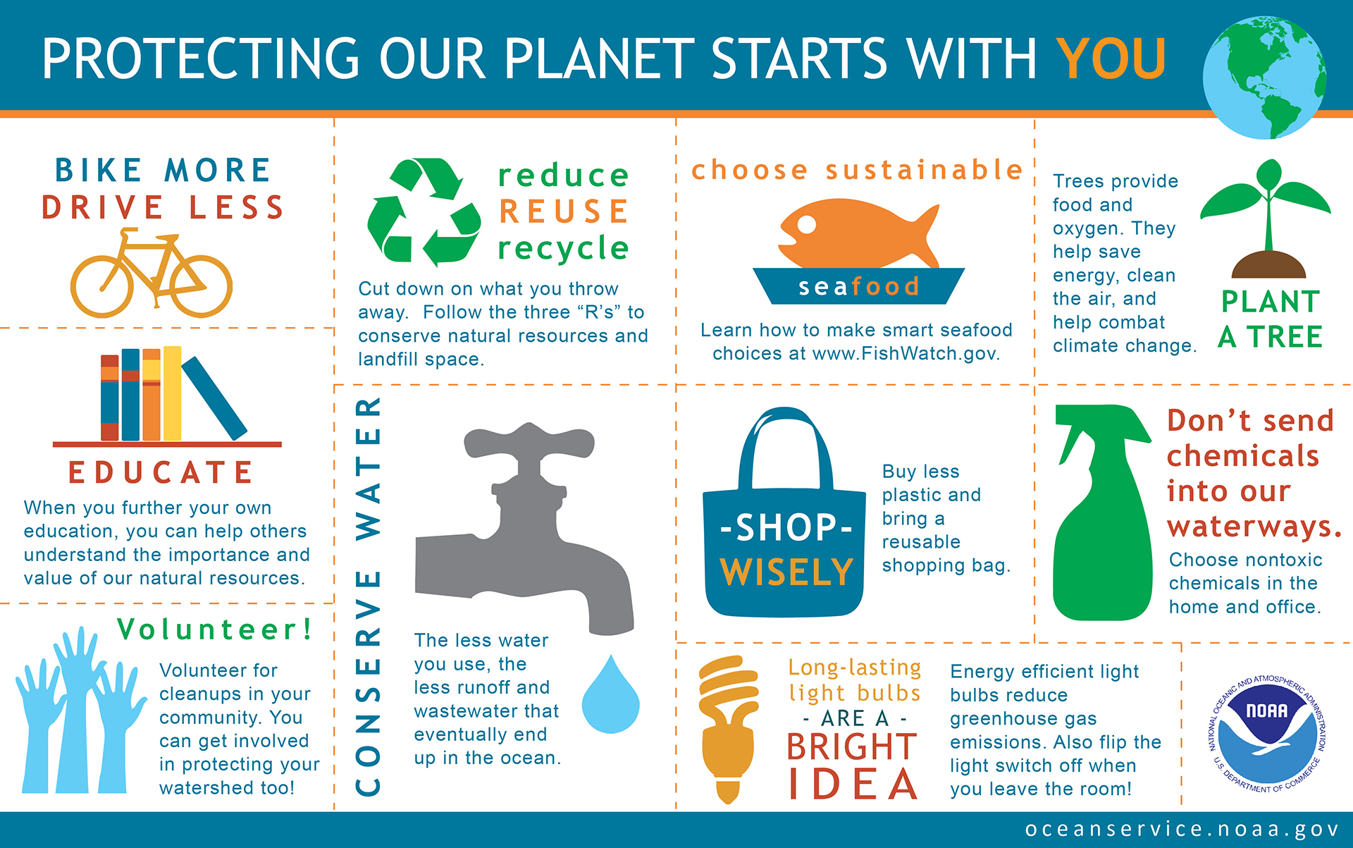
This infographic is effective because of the clean layout that the designer has chosen, the use of simple images and square spaces is part of why it is effective. This infographic also does not try to flood you with information by keeping it brief allowing the viewer to not feel a sense of overflowing information.
(http://oceanservice.noaa.gov/ocean/earthday-infographic-large.jpg , Protecting the planet Typographic)
This inforgraphic attempts to inform you about obesity by using minimalistic but effective images and using bright colours in order to attract your eyes to some parts of the important bits of the infographic. The problem with this infographic is that there is a lot of information to take in so the reader can easily get bored when reading, but I had also noticed that the text always has a different style on each sentence in order to keep people reading.
(http://www.heart.org/idc/groups/heart-public/@wcm/@fc/documents/image/~extract/UCM_467594~1~staticrendition/ginormous.jpg , obesity in preschoolers typographic)
This infographic has a very convincing and clever way in displaying it's information through the use of images and large text. This works especially well as my eyes divert directly to those parts of the poster before I read what the poster is even about. The poster also keeps a similar use of colour range in order to keep it related to the company. I believe this to be an effective way to display information of such a large scale, being split up into different locations. The only cons towards this would be that there is a lot to read so the viewer may not be interested enough to read it, it would depend on the person.
This infographic is simple and effective in it's attempt to give out quick and simple information, by looking at this I can see that this is a bar chart based upon the usage of chrome via each country showing different statistics. In my opinion I would've preferred it if the information that is show was sorted depending on highest to lowest statistic, but that would come under preference and can be different for other people.
(http://elearninginfographics.com/wp-content/uploads/K-12-Education-Tech-Infographic.png , Google Chrome worldwide adoption)
The idea behind the display of this infographic intrigued me a lot because of it's use of splitting up a Fuel can in order to show information being split up. The use of blue works especially well against the red can as a colour to display information. Because of the use of 'white-space' this makes the infographic to appear clean and quite simple for the viewer to not have much trouble reading.
Although this infographic shows information based upon the cold war, I do not believe it to be effective for the viewing in public, as it's content is very cluttered and not very thought about. If this infographic had not used background images I believe it may have been slightly more effective. I also believe that there should've been a different text font used, as this one is near unreadable and dramatically effects the usage of this poster, as we want to make it simple for the viewer to read.
(http://onlinelearningtips.com/wp-content/uploads/2012/10/Cold_War_Infographic.jpg , cold war infographic)
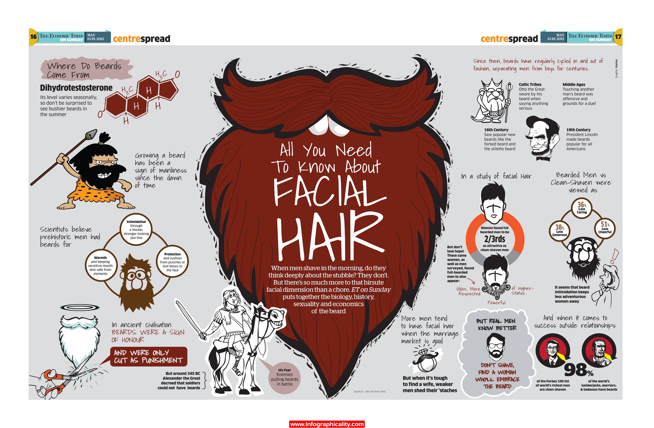
I really like this infographic because of it's use of creative imagery around the poster, as it gives off a unique feel that I have not seen before. Because of this continuous usage it makes me feel inclined to read more, which has the ability to pull me in, something like this could be extremely useful for when I come to create my own infographic.
This animated infographic is especially useful in it's use of simplicity in order to get it's message across. This simplicity allows for a complex subject to be expressed through diagrams and speech giving the designer a whole variety of subject to go across in order to display his message. The designer of this infographic uses a perfect arrange of colours in order to keep the attention of the viewer. This is especially effective for it's professional vocal work as well, which doesn't seem too loud or incoherent.
Just like the other one, this one is especially usefull in it's use of colour. animation and vocal work. Although similar, This one displays a comedic value towards it, making it more attractive to those who enjoy this sense of humor. The use of thumbnail as well, seems to be very effective into bringing people in for its usage of Adolf Hitler, whom has a very bad reputation.
Early Design Process
For this Unit I have been given the task to create my own infographic, in doing so I need to collect a series already made inforgrapics out there, in order for me to gain a understanding and possibly use this as inspiration later on.
I began working on ideas that I could use in order to make an infographic that would've been possible to my knowledge and skill within the programs that I am going to use. I thought about creating infographics on Japan, Science, Anime and Video Games. All things that I have a vast knowledge on that could allow me to create a successful infographic.
I began early on with finding currently existing infographics based upon video games. I had a change of heart early on about my idea, as I felt that I could create something more culturally teaching than this topic, on top of that I felt that I would be more inspired to do a topic that I have not already done before to get a fresh start.
This is the moodboard I had created to symbolise Ancient Japan and possibly show me some inspiration whilst working on the infographic.
I began working on the structure of the poster before working on it, therefore I would know what I would need to make. I took the most important events that happened during the events of 'Segoku Jidai' and began to structure my images around it.
I began thinking about how I should start on this project so I wrote up the key events that happened and began working around them, I Structured my work in the form of time lapse:
The Onin War
The alliance between Tekeda, Hojo and Imagawa
Tekeda information
Oda Nobunaga information
Mitsuhide's betrayal of Oda
Battle of Sekigahara / Ieyasu's rise to power
Unified Japan under the Tokugawa rule
I immediately began working on the Tekeda image, I created a base for him and began working on specific details that would allow the viewer to instantly know that it was him.
I then worked on the next character 'Tenkai', it is rumoured that he may or may not be real, as his existence was not well documented.
I then worked on Oda Nobunaga, a famous daimyo known very well for his viscousness and fast expansion across Japan.
After awhile I began working on several different icons and characters that could be possibly used in the poster.
I then imported them all into photoshop so that I could possibly use the for the poster later on.
I had felt like my poster was lacking a background so I began working on some ideas as to what it could look like. This is an early design which was later changed, but had shown some inspiration to the final piece.
I began looking for a font that would work really well for my title on 'www.Dafont.com' and had found a huge selection.
I began testing each one to see how they worked against the final background.
Being happy with this type face I began positioning each image into place of where they may go.
I had noticed that placement of several images did not work well as they had a cut off so I created trees to hid their cut off points and had also placed Tekeda behind the mountain.
After finishing placement I began working on where I should place text using purple/pink text boxes as place holders to give me an idea of how much space I have to work on.
I then changed the font used in order for it to be similar to the title.
I wanted to make sure that the characters were visible so I had to make sure that it did not overlay them.
Here is the finalized version of the poster before print. I had been extremely happy with how it came out.
For the animation I have changed the structure of information that is given to the viewer due to the restriction of time, which wont allow me to cover everything. Listed bellow is the information that I will cover.
The sengoku jidai lasting for approximately 150 years before coming to an end.
Oda Nobunaga seized kyoto for himself in order to install a 'puppet' shogunate in order for him to do his bidding.
Mitsuhide's betrayal to Oda Nobunaga.
Mitsuhide's 13 day shogunate throne.
Ieyasu's rise to shogunate.
I began to display my work to others and had found that it was very hard to work on a huge historical project within a thirty second time limit. Although it was a very hard task to fit in that much information, I had enjoyed creating and developing it. Marios had a look at my animation and had gave some vital feedback on it. He had mentioned both positive and negative points about the animation, which allows me to reflect on what I have created and give me some pointers on how I could improve it in the future.
Marios doe raise a valid point about the vocal being "very fast", as I was concerned about this myself with the amount of information I had to fit into thirty seconds. In future I may need to shorten down how much information I use or think of a different way to display information which would allow for enough time for slower vocal work.