Interactive Story Development
In this unit I am required by a small independent game company to produce my own interactive story concept. The company want the story to be based around a oncoming catastrophe cause by increasing global warming. For me to start building ideas it would be useful to me to create a mind map of the effects of global warming, so that I would have a basic idea of what I could base my story around. The company have also asked for the characters to come from a different background than most western areas, this could allow me to explore ares such as, Russia, Asia, the middle east. Doing this will allow me to become more aware of those locations after a research period.
Existing Game & Interactive Story Research
before creating my own story I must first understand existing products that are currently out on the market or possibly stories that exist before time of civilisation. there are different forms of story telling that have different ways of explaining, such as caveman paintings show a story that you can understand by viewing the portraits that they had created. Looking at this image below you can see what appears to be 5 people and 2 deer, you can see that the humans are trying to hunt the deer, possibly for food or other purposes.

http://apistrat-presentation.herokuapp.com/images/cave.jpg
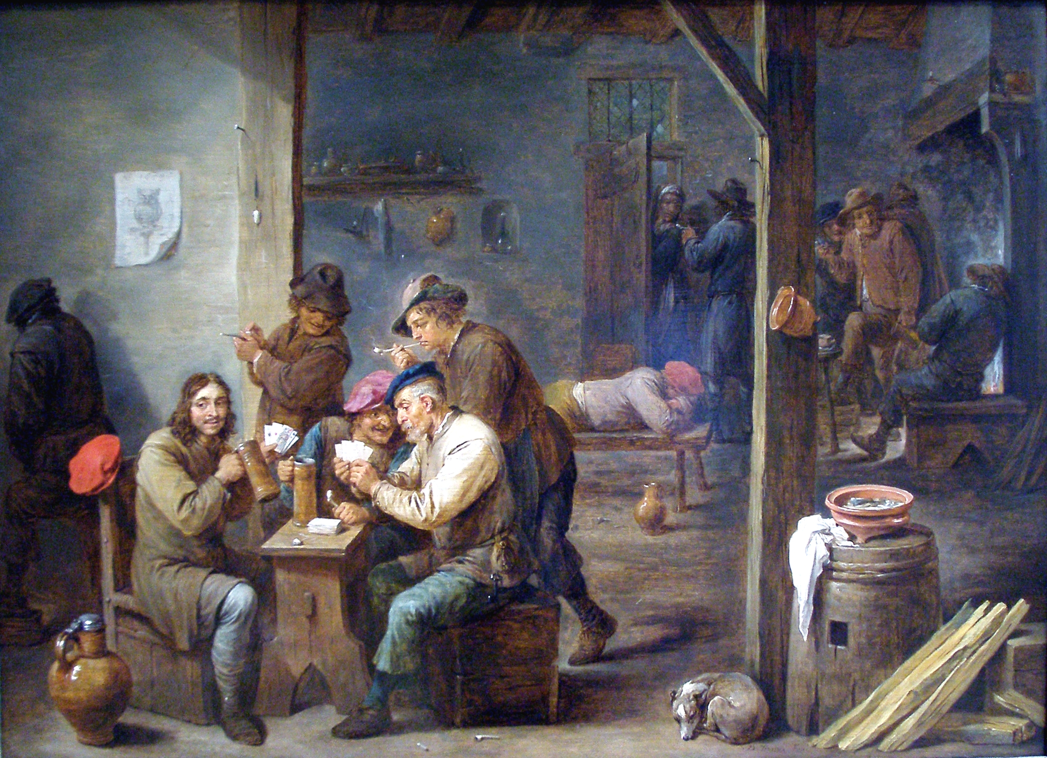
Other ways of telling a story is through the traditional way of oral conversation where people would tell myths, legends and fable in taverns or local areas where people would meet and talk. such a story as, king Arthur fighting a dragon, could have originated from taverns, as these places were the go to for all the latest news and stories, which led to some historical inaccuracies.
http://upload.wikimedia.org/wikipedia/commons/5/56/Tavern_Scene-1658-David_Teniers_II.jpg
Theatres were also great ways for people to tell stories through acting out plays as characters. This set out to be a commercial success during Shakespeare popularity peak, as people came to see the stories that this man had created and had paved the way for theatre. As time went on, so did technology, which had allowed for new ways for stories to be watched from anywhere with a new device at the time called a television.

http://www.coolplaces.co.uk/system/images/3163/winchester-theatre-royal-winchester-rainy-day-3163-large.jpg
Story through video games genres
There are many different game genres today that people can pick from in order to enjoy different styles of storytelling. These genres include First Person Shooter (FPS), Third Person Shooter (TPS), fighting, adventure, roleplay, Real time Strategy (RTS), Turn Based Strategy (TBS) and Multiplayer Online Battle Arena.
First Person Shooter games generally consist of the player having to go through a series of obstacles and opponents in order to get a objective. An example of game that is part of the FPS genre is Halo, as the player is tasked out to protect a 'AI' chip named cortana, but the character is put through a series of enemies to attempt to escape, but lands on this ring called halo, as the story develops, the player finds out more about the story.

(http://mruploader23.webs.com/photos/Halo-anniversarry/halo%201%20graphics.jpg)
Command and conquer is a real time strategy game that attempts to tell its story through the use of live action and CGI cutscenes that usually sets up your next course of action against the enemy faction. With command and conquer you have the choice of playing either faction in order to see how the story would play out if that faction had won the war against the other, giving you details you would miss if you only played one side of the story.

(http://onlyfullgame.com/wp-content/uploads/2014/12/Command-Conquer-download-full-version.jpg)
Video games like Gears of War are considered Third-Person games due to where the camera is placed on the characters, generally it is behind the shoulder of the main character to give off more immersion that you are that important character. Most Third person games consist of shooter type objectives. 'Gears of War's story is based on Marcus Fenix's side of the war against the locust horde. At the start of the game not much is explained about what is going on around the world, there are only hints that are given to show things are not right. These hints then intrigue the player into playing more to find out what it going on into the story. During this game Marcus is seen as the heroic character through his thoughts and actions against the locust. This is aided further through the use of cut-scenes to show action packed events which could change the viewers look on a certain character or characters.
 (http://www.thebuzzmedia.com/wp-content/uploads/2008/09/gears-of-war-2-explosive-canisters.jpg)
Approaches to a game story
There are many ways to set up a video game story, such as three arc story, episodic and Hero's journey. Episodic stories are very popular at the moment, with such releases like, the walking dead video game, Bioshock infinite DLC and Half life 2 episode 1 & 2. Games like these allow for artist to create quick and fun stories that require smaller effort to release to the public, than it would from a full game, and will keep them wanting more from them.
 (http://upload.wikimedia.org/wikipedia/en/f/f3/TWD-game-cover.jpg)
Three arc stories are featured in most game that have a Progressive story behind it. These type of stories generally consist of a start, middle and end setting. This type of structure would start of with slow information that would tell you the underline basis of what is going on in the universe of the story and as you progress through it, things become more intense and dramatic to hook the viewer into continuing the story. This usually happens between the middle and the end of the story, usually in the middle, where something drastic would happen and cause for a sudden change of events. Usually the main character would be able to solve and correct the drastic events, which would come to a resolution and ease the tension that the player feels. A story that uses this arc type would be Halo 1 as the game starts off with master chief, the main character, sleeping inside of a cryo-tube when he has to be awakened due to the ship he is on, being tailed by an alien race, as master chief gets to the pilot area he is told about this 'Halo' world that has appeared in front of them. He lands on this 'halo' only to find out what it is used for, expanding the story to a whole new level. The story gets to a mid point when 'the flood' get released and start killing both humans and covenant and the master chief finds a index which he is almost tricked into using on which he thinks will get rid of the flood, but it would rather destroy all life in the universe.Nearing the closure of the game, master chief has turned the 'Pillar of Autumn' into a bomb that would blow up 'Halo' and save the galaxy from the flood threat. Master chief has a certain amount of time to get off 'Halo' before it explodes putting the game at it's highest tension point before the ending. during the ending of the game, it uses soft and slow music to lower the tension level.
 (http://upload.wikimedia.org/wikipedia/en/8/80/Halo_-_Combat_Evolved_(XBox_version_-_box_art).jpg)
Hero's journey, or 12 point structure, I have noticed to be used a lot of Japanese anime, such as, Dragon Ball Z, Sword art Online, 'Shigenki no kyojin' and it appears to be a very common structure to be used, as well as, most Level based Role playing games, such as Fable, 'Kingdoms of Amalur' and 'Two worlds'. Hero's journeys 12 points are; The ordinary world, the call for adventure, refusal of the call, meeting with a mentor, crossing the threshold, tests allies and enemies, Approach, The ordeal, The reward, The road back, The resurrection and return to normal life, or to continue on the adventure. These types of games have long story lines with in depth information that might be useful to the games setting, which can be fun to read and learn about.

http://upload.wikimedia.org/wikipedia/en/b/b4/Kingdoms_of_Amalur_Reckoning_cover.png
Video games like Gears of War are considered Third-Person games due to where the camera is placed on the characters, generally it is behind the shoulder of the main character to give off more immersion that you are that important character. Most Third person games consist of shooter type objectives. 'Gears of War's story is based on Marcus Fenix's side of the war against the locust horde. At the start of the game not much is explained about what is going on around the world, there are only hints that are given to show things are not right. These hints then intrigue the player into playing more to find out what it going on into the story. During this game Marcus is seen as the heroic character through his thoughts and actions against the locust. This is aided further through the use of cut-scenes to show action packed events which could change the viewers look on a certain character or characters.

Approaches to a game story
There are many ways to set up a video game story, such as three arc story, episodic and Hero's journey. Episodic stories are very popular at the moment, with such releases like, the walking dead video game, Bioshock infinite DLC and Half life 2 episode 1 & 2. Games like these allow for artist to create quick and fun stories that require smaller effort to release to the public, than it would from a full game, and will keep them wanting more from them.

Three arc stories are featured in most game that have a Progressive story behind it. These type of stories generally consist of a start, middle and end setting. This type of structure would start of with slow information that would tell you the underline basis of what is going on in the universe of the story and as you progress through it, things become more intense and dramatic to hook the viewer into continuing the story. This usually happens between the middle and the end of the story, usually in the middle, where something drastic would happen and cause for a sudden change of events. Usually the main character would be able to solve and correct the drastic events, which would come to a resolution and ease the tension that the player feels. A story that uses this arc type would be Halo 1 as the game starts off with master chief, the main character, sleeping inside of a cryo-tube when he has to be awakened due to the ship he is on, being tailed by an alien race, as master chief gets to the pilot area he is told about this 'Halo' world that has appeared in front of them. He lands on this 'halo' only to find out what it is used for, expanding the story to a whole new level. The story gets to a mid point when 'the flood' get released and start killing both humans and covenant and the master chief finds a index which he is almost tricked into using on which he thinks will get rid of the flood, but it would rather destroy all life in the universe.Nearing the closure of the game, master chief has turned the 'Pillar of Autumn' into a bomb that would blow up 'Halo' and save the galaxy from the flood threat. Master chief has a certain amount of time to get off 'Halo' before it explodes putting the game at it's highest tension point before the ending. during the ending of the game, it uses soft and slow music to lower the tension level.
.jpg)
Hero's journey, or 12 point structure, I have noticed to be used a lot of Japanese anime, such as, Dragon Ball Z, Sword art Online, 'Shigenki no kyojin' and it appears to be a very common structure to be used, as well as, most Level based Role playing games, such as Fable, 'Kingdoms of Amalur' and 'Two worlds'. Hero's journeys 12 points are; The ordinary world, the call for adventure, refusal of the call, meeting with a mentor, crossing the threshold, tests allies and enemies, Approach, The ordeal, The reward, The road back, The resurrection and return to normal life, or to continue on the adventure. These types of games have long story lines with in depth information that might be useful to the games setting, which can be fun to read and learn about.

http://upload.wikimedia.org/wikipedia/en/b/b4/Kingdoms_of_Amalur_Reckoning_cover.png
Mind Map containing story ideas and character design

8 points of story timeline
1.Stasis
The story is set in 'Kami-Koshiki' island where the character is stuck in the city 'Sononaka' underneath a broken building.
The story is set in 'Kami-Koshiki' island where the character is stuck in the city 'Sononaka' underneath a broken building.
2.Trigger
The protagonist Yukimura is stuck due to a recent tsunami that destroyed the entire island, knocking him out cold, which had lasted several days. In a miracle Yukimura survives, but is heavily injured.
3.The quest
The protagonist Yukimura is stuck due to a recent tsunami that destroyed the entire island, knocking him out cold, which had lasted several days. In a miracle Yukimura survives, but is heavily injured.
3.The quest
Yukimura must find his way out of the broken building and see what remains of his once loved city, driven by sadness, Yukimura is focused on finding out what happened to his loved one whilst trying to survive the new dangers that await him.
4.Surprise
Yukimura must build a boat out of salvage in order to get across the sea to the mainland in order to get some information, as the mainland was hopefully not affected by the tsunami, Yukimura hopes for news on his wife when he gets there, but as he begins to sail out towards inland Kagoshima, Toshi appears chasing after Yukimura and begins swimming towards the shaft. Yukimura must decide where to abandon the shaft and face Toshi or sail towards land and face him on land, which if chosen to face on land then Yukimura and Toshi will settle their differences and work together in order to get inland.
Yukimura must build a boat out of salvage in order to get across the sea to the mainland in order to get some information, as the mainland was hopefully not affected by the tsunami, Yukimura hopes for news on his wife when he gets there, but as he begins to sail out towards inland Kagoshima, Toshi appears chasing after Yukimura and begins swimming towards the shaft. Yukimura must decide where to abandon the shaft and face Toshi or sail towards land and face him on land, which if chosen to face on land then Yukimura and Toshi will settle their differences and work together in order to get inland.
5.Critical choice
After arriving in Kagoshima, Yukimura learns of an even bigger threat that dooms his chances of finding his wife and must decide whether or not he will take to the lawful right of way and ask the government on the location of his wife, which may lead to him not getting answers, or accepting Toshi's unlawful offer from the Yakuza to allow them to do some investigation in order to find Saori.
After arriving in Kagoshima, Yukimura learns of an even bigger threat that dooms his chances of finding his wife and must decide whether or not he will take to the lawful right of way and ask the government on the location of his wife, which may lead to him not getting answers, or accepting Toshi's unlawful offer from the Yakuza to allow them to do some investigation in order to find Saori.
6.Climax
Following the Yakuza's one time deal allows for Yukimura to find Saori still alive in time for the incoming catastrophe is about to set course and change history forever. After the tsunami happened scientists had found that is was now regular earthquake and that this one had opened a whole in the sea, which will boil the water in the area effectively melt the ice caps at a substantial rate. This will cause increase in flooded areas and will resort in people having to flea to higher altitudes.
Following the governments help on the other hand will have the character at a dead end with no results, but the protagonist will only come across Saori purely by accident as she was moving to higher altitude in order to survive the incoming catastrophe. This option will have the story told in a faster speed than if they picked the other due to the amount of time spent by the protagonist.
Following the Yakuza's one time deal allows for Yukimura to find Saori still alive in time for the incoming catastrophe is about to set course and change history forever. After the tsunami happened scientists had found that is was now regular earthquake and that this one had opened a whole in the sea, which will boil the water in the area effectively melt the ice caps at a substantial rate. This will cause increase in flooded areas and will resort in people having to flea to higher altitudes.
Following the governments help on the other hand will have the character at a dead end with no results, but the protagonist will only come across Saori purely by accident as she was moving to higher altitude in order to survive the incoming catastrophe. This option will have the story told in a faster speed than if they picked the other due to the amount of time spent by the protagonist.
7.Reversal
Saori will be angry towards the character for not being with them when the tsunami did happen, leaving her to get away from it alone. The protagonist will then get the choice of two options to explain himself, or not, effecting the relationship between these two characters.
Saori will be angry towards the character for not being with them when the tsunami did happen, leaving her to get away from it alone. The protagonist will then get the choice of two options to explain himself, or not, effecting the relationship between these two characters.
8.Resolution
Saori will learn to forgive the character as time goes on, but will take time in order to do so. Whilst this is happening, the duo will be heading toward the best place to go, which is picked by the character, whilst they wait for the catastrophe to happen.
(https://www.youtube.com/watch?v=KVCLXZ99rps For use of later)


Saori will learn to forgive the character as time goes on, but will take time in order to do so. Whilst this is happening, the duo will be heading toward the best place to go, which is picked by the character, whilst they wait for the catastrophe to happen.
(https://www.youtube.com/watch?v=KVCLXZ99rps For use of later)
Storyboard
Computer Game story
Twilight sunrise
Intro
Today marks a day
that the world would never forget. An oncoming tsunami had hit the local island
of Kami-koshiki causing mass destruction for all those who live there. The
story follows a young man, Yukimura, who had been well known within the
society, had met an unfortunate series of events that brings him here, underneath
rubble. Alone with only memories of a siren and his wife.
Beginning
Yukimura wakes up,
bleeding from the leg, in the debris of a broken building, the floor is flooded
and the walls have deteriorated.
“Where am I?” Yukimura
mumbles to himself, as he tries to come to grips with what happened.
He attempts to get
up, but groans in pain as he realizes the damage to his body, falling back down
into a puddle. After looking around the room for some time, he spots a first
aid kit in which he will be able to use to wrap his wound.
Yukimura surveys the
room he currently is in and attempts to break out the only door in the room.
Upon doing so Yukimura comes across “Toshi” who is in an aggravated state.
“Stay away from me you
little sh*t” Toshi shouts with disbelief in his face. Toshi stumbles across the floor
pushing at Yukimura with the little strength he had left.
Toshi and Yukimura
fight, with Yukimura only managing to get away.
Toshi shouts “I’ll
find you, the yakuza will not forget!” as Yukimura runs off.
The surrounding area
no longer looks familiar to Yukimura. Washed up houses, destroyed crops, over
turned vehicles and death, mostly inaccessible from continued flooding that has
not been drained yet.
These are scenes that
no man should have to endure. After searching for several hours, Yukimura comes
across a small part of the island that was unaffected by the flooding, which
had a gorgeous beach that would make you forget that the disaster has ever
happened. Yukimura builds a water shaft in order to swim inland towards Kagoshima.
As Yukimura begins to push the shaft out to sea, Toshi appears, recovered from
the clash earlier.
“Where do you think
you’re going?” Demanded Toshi as he ran faster towards Yukimura.
Conflict breaks out
between the two characters, which results with dialogue between them.
“Why are you doing
this? Even in this time of despair?” Asked Yukimura
“Because there’s not
much I have left, my friends, my family, all I had is gone because of this. I
need that shaft to get out of here and I will take any means necessary to get
it” Toshi says
frantically.
“Then why are you
being aggressive in this time of need, you are not the only one with problems
and concerns as well” Yukimura replies.
“My needs are more
important than anyone else” Toshi said
“Why, because you are
concerned that someone may be alive that you care for, or do you just wish to
rejoin with your ‘Yakuza’ buddies” Yukimura replied
“You know nothing
about my life, you don’t even know me” Toshi says in an angry fury.
An awkward silence leaves these two characters pausing for a moment.
"Look, I know you're going through a hard time, but it would benefit us both to work together to get inland" Yukimura replies
"Okay" Toshi nods in confirmation
Adjustments are made to the shaft in order to allow the weight of both of them.
Both characters push the shaft out into the sea and climb on, during the way to Sonaka. dialogue is exchanged between both characters.
"So, what brought you to kami-koshiki?" Yukimura asks
"Some of my friends and I were going on vacation here for a good few weeks when we had had a few drinks at a bar and got into a fight to where I woke up stuck in a broken building, I had no idea what was going on." Toshi replies.
"That sounds unfortunate for you, I had family and friends here who evacuated early, but I had been pressed by my boss to continue working as he assured that I would be safe, that was not the case unfortunately, I am unsure whether my family got out alive or not, even so I do not know where they have gone to. They're probably worrying about me more now" Yukimura responds
"I see, I might be able to help you with finding your family, I can put in a word to my friends inland to look for them. Do not fret, I will not ask for favours back for helping you, in a sense you saved my life allowing me to board this shaft with you." Toshi says.
*AT THIS POINT THE PLAYER GETS TO CHOOSE TWO OPTIONS IN WHICH EFFECTS THE COURSE OF THE STORY TO A DEGREE, OPTION A, HAS THE CHARACTER ACCEPTING HELP FROM TOSHI WHICH IS ALONG THE TRUE STORYLINE OR THEN CAN PICK OPTION B, WHICH THE CHARACTER DECIDES TO ASK GOVERNMENT FOR HELP TO FIND SAORI, IN WHICH, COMES BACK WITH NO RESULTS AND ALTERS THE STORY.*
Option A
"So you have decided to take my help then. It should not be that hard to find her using the matching description you gave us." Toshi Responds
Option B
"I understand, good luck finding her. it's a tough time out there." Toshi responds
Main story
"We are almost inland." Yukimura notes
"I know, I'm glad that I've gotten through this, but they say more trouble is on the way." Toshi says
"What do you mean?" Yukimura questions
"Didn't you hear? Due to that last earthquake water levels have been rising at an extremely fast rate. They say the caps have melted to an irreversible point. It caused something to shift and change the world faster than I've ever seen." Toshi responds
"This is troubling news." Yukimura says
"You bet." Toshi pauses
"They're telling everyone to head inland towards the mountains in order to stay clear from the oncoming disaster. My best bet would be to listen to that advice"
"Ah, we're here." Toshi adds on.
Both characters disembark the shaft and step onto land.
"So what now?" Yukimura asks
"I'll see if I can get us a ride" Toshi responds
Toshi pulls out his phone.
"Lucky this thing still works... Ah a signal!"
Toshi then calls friends of his that is in the area.
"They should be here soon."
The van arrives and both characters get into it. If the player had chosen option A then the next scene would take them to Toshi's workplace. If the player had chosen option B then Yukimura is dropped off outside of a government building.
Option A
Toshi and Yukimura are dropped off outside Toshi's work place and head inside. Toshi sits down in his luxury office chair and puts his feet up on the table on front of him. Yukimura. on the other hand, nervously looks out the window into the distance, worried of what might have happened to his loved one.
"Look, since you helped me I'm going to help you"
Toshi pushes a bag of items across the desk
"This should help you for the next few days, it's the least I can do." Toshi says
A huge man opens the door violently whilst he is out of breath. The man is panting as he is bent around the door.
"Sir, we found her" He says
Yukimura turns round immediately with open eyes with interest in the news.
"Where to?!" Yukimura demanded.
The man looks at Yukimura and then back at Toshi for confirmation.
"Go on." Toshi says
"Our men report that she is currently at the Sonaka aid camp and that they're all preparing to move inland." The man says
"I need to go" Yukimura responds
"Come with me I'll give you a lift" Toshi replies
Toshi and Yukimura get into the car and drive to the destination.
Once arrived, Yukimura gets out the car.
"Hey" Toshi shouts
Yukimura turns to looks at Toshi
"Good luck out there" Toshi says
"You too" Yukimura responds
Toshi pulls away and drives off
Option B
Toshi is dropped off outside of the local government building, he waves off and begins to walk inside.
"Hello I am here to find a missing person" Yukimura asks
"I'm sorry but we're not able to help you, due to the recent news of the increased water level we've had to evacuate most of the staff, we apologise for the inconvenience. You could check at the aid camp just a few blocks from here though." The receptionist responds
"Thanks." Yukimura responds, disappointed as he looks around and then leaves.
Yukimura heads towards the aid camp.
Main story
Yukimura walks throughout the aid camp only just managing to find Saori
"Saori!" Yukimura shouts
Soari turns around with a face of shock turning into happiness. The two character have a tight hug.
"I thought you were dead!" Saori cries
"I was so worried about you too" Yukimura replies
"Where have you been?" Saori questions
"I was forced to do over-time by my boss, I was lucky that the building did not collapse fully" Yukimura replies
"Typical."
"It's always like you to never say no to anything, you need to grow up, it's going to kill you like it almost did." Saori responds in anger
"But.. I am so glad to se-" Saori gets interrupted
"ATTENTION! CAN ALL CITIZENS MAKE THEIR WAY INLAND IMMEDIATELY! 20 MINUTES IS ALL THAT REMAINS" The speaker blurts out
"We should move" Yukimura says concerning
"Yeah.." Saori replies
At this point the user has a choice of 3 altitudes to pick from low, medium and high. each one result in a different events which link together.
Low altitude
Yukimura and saori arrive at a location at low altitude but immediately it is not safe to stay.
"We should move to higher ground." Saori says
"Yeah." Yukimura agree
The two characters move towards higher ground.
Medium altitude
The two characters arrive at higher altitude and are given some time to rest before the water level starts to almost catch up to them.
"It is not safe here either." Saori says worryingly
"Let's hope the water level stops soon. Come on let's get to higher ground." Yukimura replies
The two characters move towards higher ground.
High altitude
It is seemingly crowded at higher elevation, Yukimura and Saori have little space to maintain.
As the two characters rest a figure is immersing from the distance. To Yukimura's eyes, he sees Toshi who is happy to see him. Smiles are on both characters faces as they know that they both made it alive.
The story is left at this point for users to question what could happen next, as things do not seem to get any better, but infact worse.
Creating the story via HTML + CSS
For me to be able create my story I first had to learn a way to bring it to life, so I had chosen to learn HTML and CSS coding on code academy. This would take me several weeks to learn as the process was very long, but in the end I had learned some very useful skills. which would help me in the future if I needed to use HTML and CSS again.
When I began creating the story I had come up with a name for what the story could be. I created a logo for it so that people could recognise and easily remember it. People suggested to me that the title was too simple and had no effect to it, so I had found a new font on www.Dafont.com called 'Orchidee' and edited the background with a powder texture to give it more feeling towards it.


As you can see in this image, small parts of the code feature small lines of code that say "id="text"" for example. This is what links it to the CSS file and changes it for all HTML pages if I went to change the CSS file.

Here is another look from a different page I worked on to show how the button links work. each button is a <Div> box with it's own id which would allow me to create how they look right now. to make them buttons that link to other pages I had to put <A> hyperlinks around each <Div> box stating where to take the user.

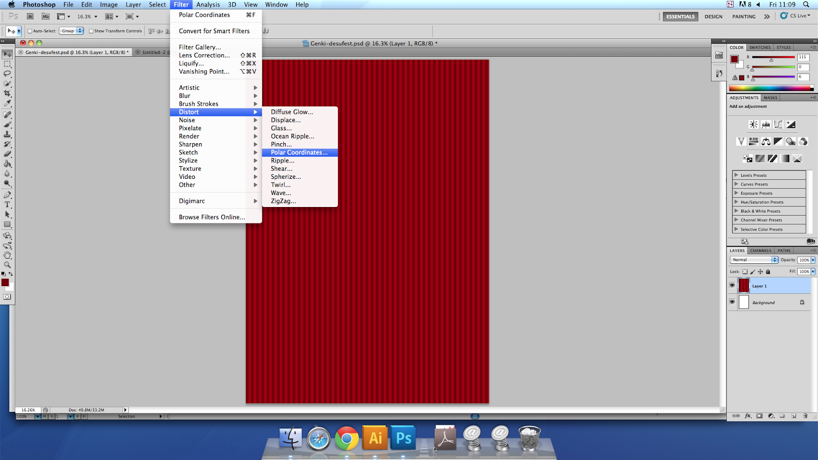
This image is a screencap of me working on a page image within photoshop. This image would be put into the folder of the website and then linked up with code inside of the HTML file that it was made for.

Alpha test play of my game accompanied by Rui and Marios.
Find my game at:
www.twilightsunrise.co.uk
Backup download the game at:
https://drive.google.com/file/d/0B2HrTGt9DLh4bW11VjhJdGc2WVk/view?usp=sharing